Portfolio — TradeSourceIn-house project · paid
A $180B market, unstuck from paper catalogs
TradeSource set out to modernize B2B furniture procurement — manufacturers, interior designers, and clients disconnected across messy data and outdated tools. I led research and design across four surfaces and a design system, with the designer placed at the center of the ecosystem.
Client engagement & in-house project. This was a client engagement that also included self-initiated, unpaid in-house studio work.
The challenge
Complex, fragmented, and mostly on paper
Furniture procurement involves multiple stakeholders, long supply chains, and outdated systems — primarily paper catalogs and fragmented digital tools. The platform had to streamline sourcing, purchasing, and delivery of large, costly items while reducing risks like vendor bankruptcies, for everyone in the chain.
$786B
global furniture market in 2025 — the US alone ~$181B (forecast $1.3T by 2033)
4
surfaces designed: desktop, mobile web, iOS, Android
2 → 4
median usability on a five-point scale, before to after
25
criteria in the custom heuristic scorecard
Market figures: Grand View Research (global & U.S. furniture market, 2025).
Generative research
Owning every part of discovery
Research ran remotely at sprint cadence — 30 to 90 minute sessions covering up to ten topics, recruited through my own network of people in the trade, with moderator and notetaker often the same person. Qualitative interviews were paired with Likert-scale measures, scored by median rather than mean.
What it surfaced
Five takeaways that shaped the platform
- 01
Sourcing is hard — and risky. Vendors keep going out of business; one designer placed an order with a vendor who later folded, and lost money.
- 02
Too many resources, too little time. Designers were overwhelmed by fragmented catalogs and outdated vendor information.
- 03
A fragmented, increasingly digital workflow. Paper catalogs and disconnected tools, made worse by pandemic-era vendor reliability.
- 04
Client communication — with guardrails. Client access to the trade catalog must be limited; pricing is sensitive since designers receive trade discounts.
- 05
Business development & a social layer. Designers saw real value in sharing insights while controlling what clients see.
Journey mapping
Discovery to delivery, end to end
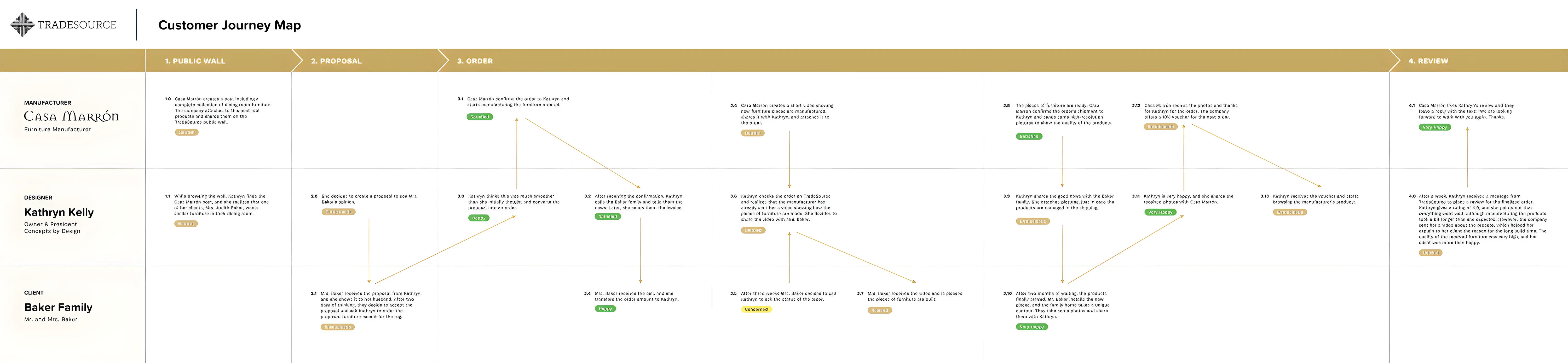
The full customer journey map, panning its whole length — every step from product discovery to final delivery across the designer, client, and manufacturer lanes.
Heuristic audit
Twenty-five criteria, scored −2 to +2
The incumbent experience was scored against a custom 25-criteria scorecard — a method created at Saatchi & Saatchi, built on Nielsen's ten heuristics and Tog's first principles — judged through the lens of a commercial interior designer sourcing furniture for a 100-person office. Where the old platform failed:
- −2
Aesthetics. Visual design not attractive for demanding tastes — no underlying grid
- −2
Completeness. Tools missing to anticipate and finish each step — no iPhone or Android app
- −2
Navigation. Blocked at key steps; no way to communicate with manufacturers
- −1
Consistency. Manufacturers had no easy way to update their online catalog
- −1
Learnability. Unintuitive navigation; search returned no meaningful results

Personas
Two designers anchored every decision

Kathryn Kelly, 35
Commercial Interior Designer
Principal Interior Designer, Design + Planning, Inc. · Los Angeles, CA
Getting the furniture right is essential — it's the ingredients that make the dish.
Sources from showrooms, sample books, and the web. The challenge: one consolidated platform that pulls every source together so she can buy directly from the manufacturer.
Needs
- High-quality commercial furniture
- Communicate directly with suppliers
- A mobile app to check projects on the go
- Inspiration & the latest trends
Challenges
- Visiting showrooms in person eats time
- Sourcebooks go out of date fast
Tasks
- Find exceptional furniture on budget
- Compare pieces, send quotes & proposals
- Collaborate and re-order past furniture
Specialties
- Commercial space design
- Hotels, restaurants & resorts
- New builds / renovations
Education: BFA, Parsons School of Design
Devices: Dell Inspiron · Google Pixel

Kristi Bennett, 44
Residential Interior Designer
Owner & President, Concepts by Design · Charleston, SC
If there was one platform where I could do it all, that would be amazing.
Runs a busy studio, always on the go — sourcing, ordering, messaging clients, and posting to social. Lives in Houzz, Wayfair, and Instagram, and wants one platform to replace them all.
Needs
- One app that simplifies her work
- Manage the full furniture lifecycle
- Self-promote her recent work
- Trade pricing in proposals
Challenges
- Never enough time in the day
- Juggling multiple websites & apps
- Clients expect status updates
Tasks
- Find & order furniture
- Send proposals to clients
- Find new business
Specialties
- Residential interiors
- Home furnishing
Education: BFA, Savannah College of Art & Design
Devices: MacBook Pro · iPhone Pro
The platform
One ecosystem, four surfaces
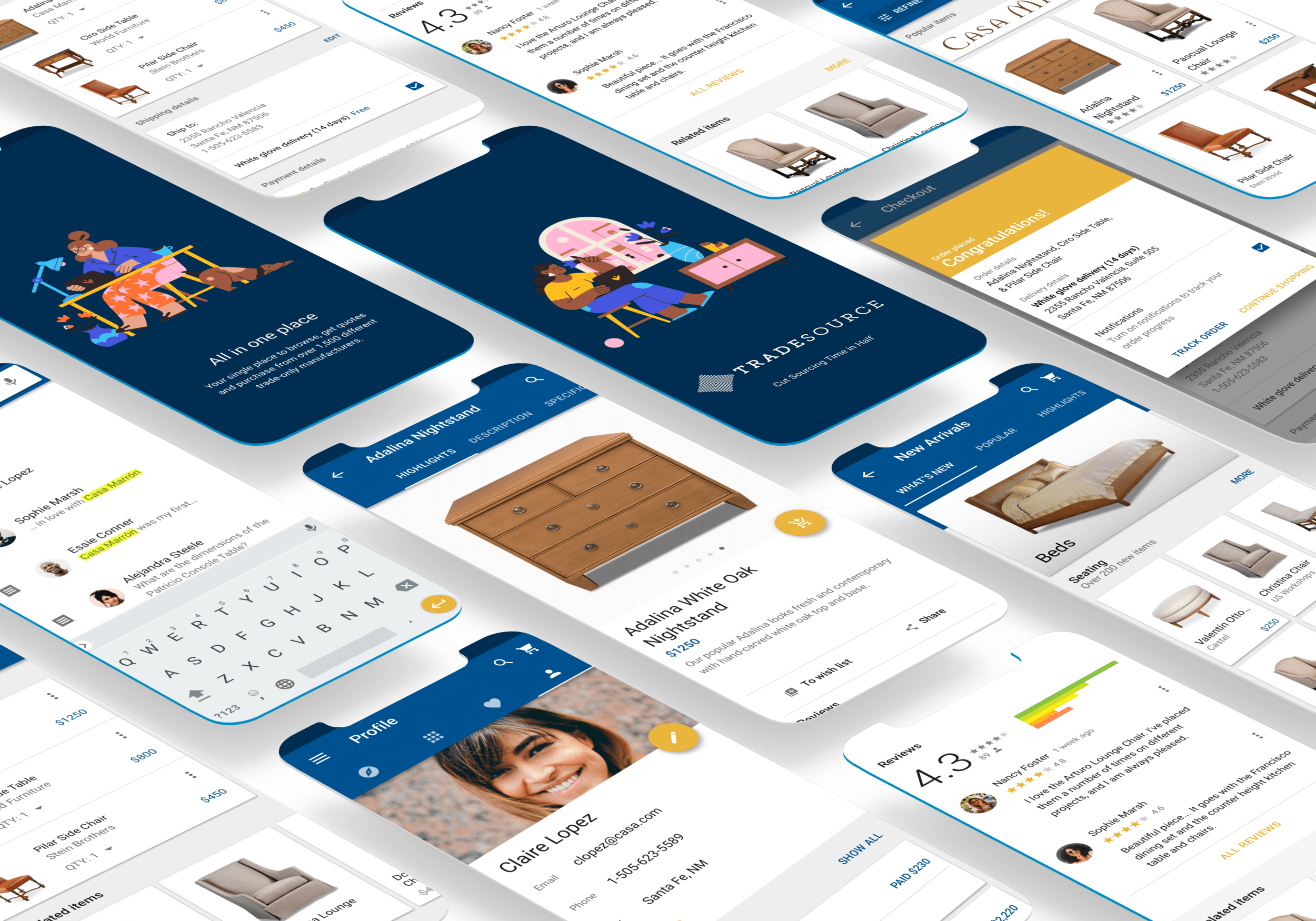
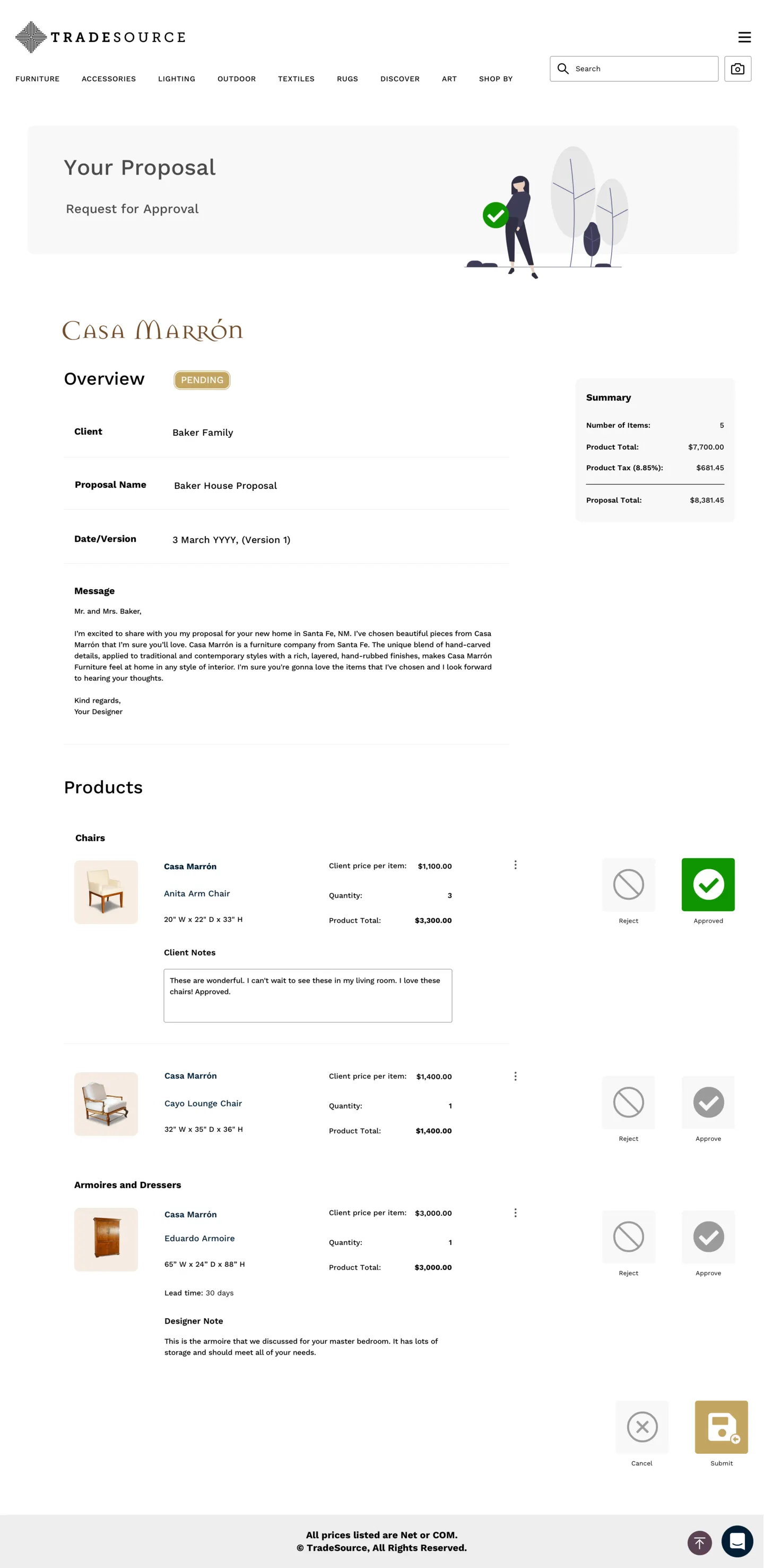
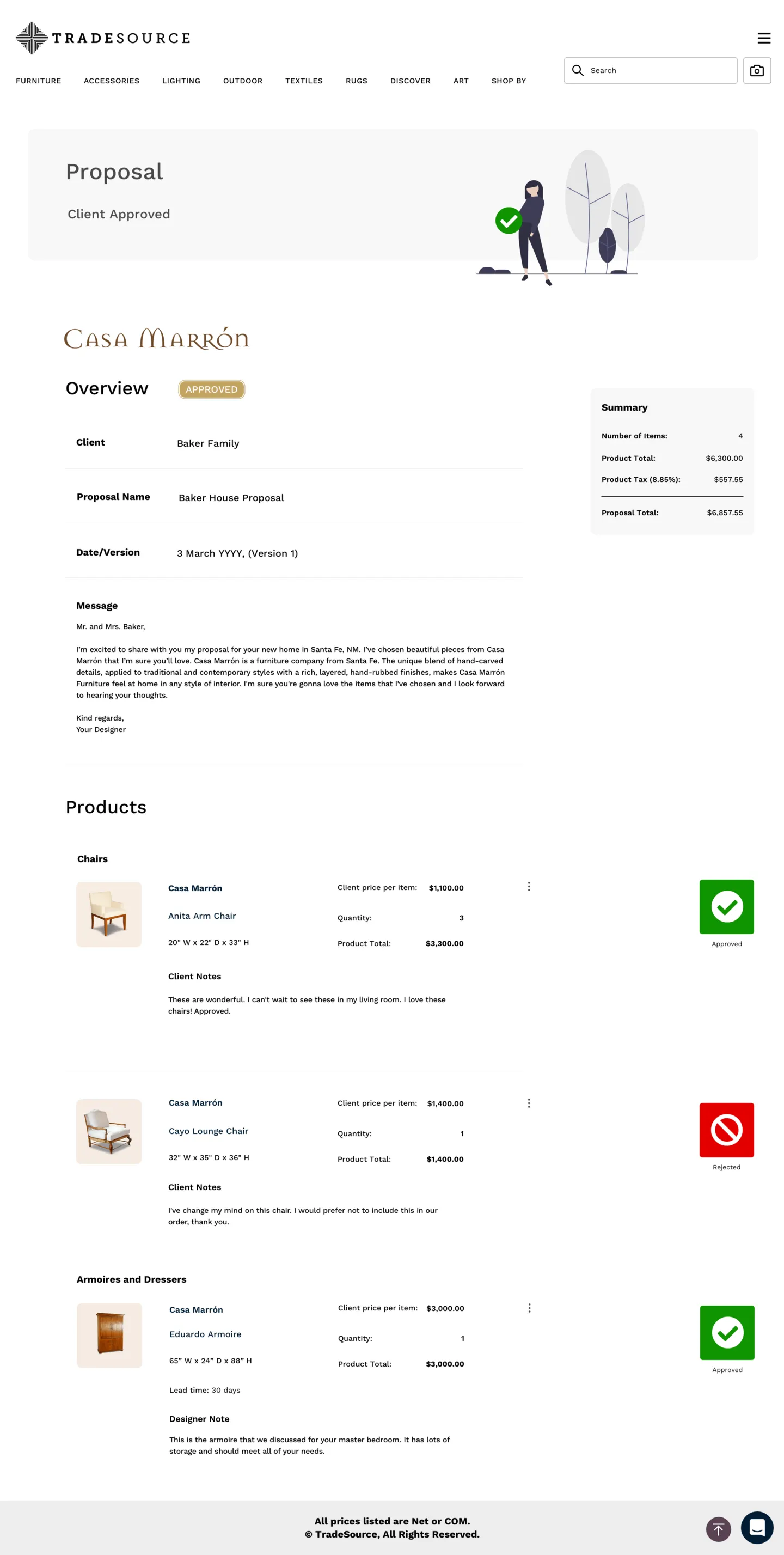
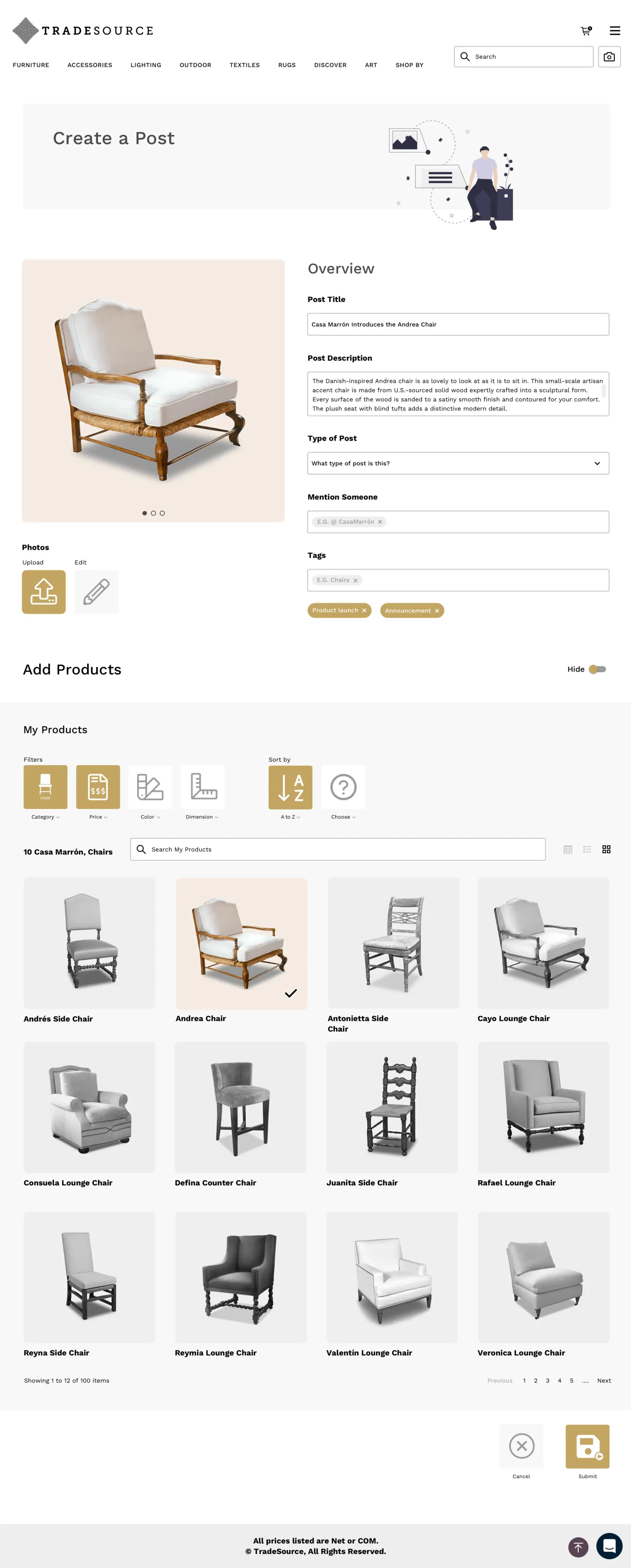
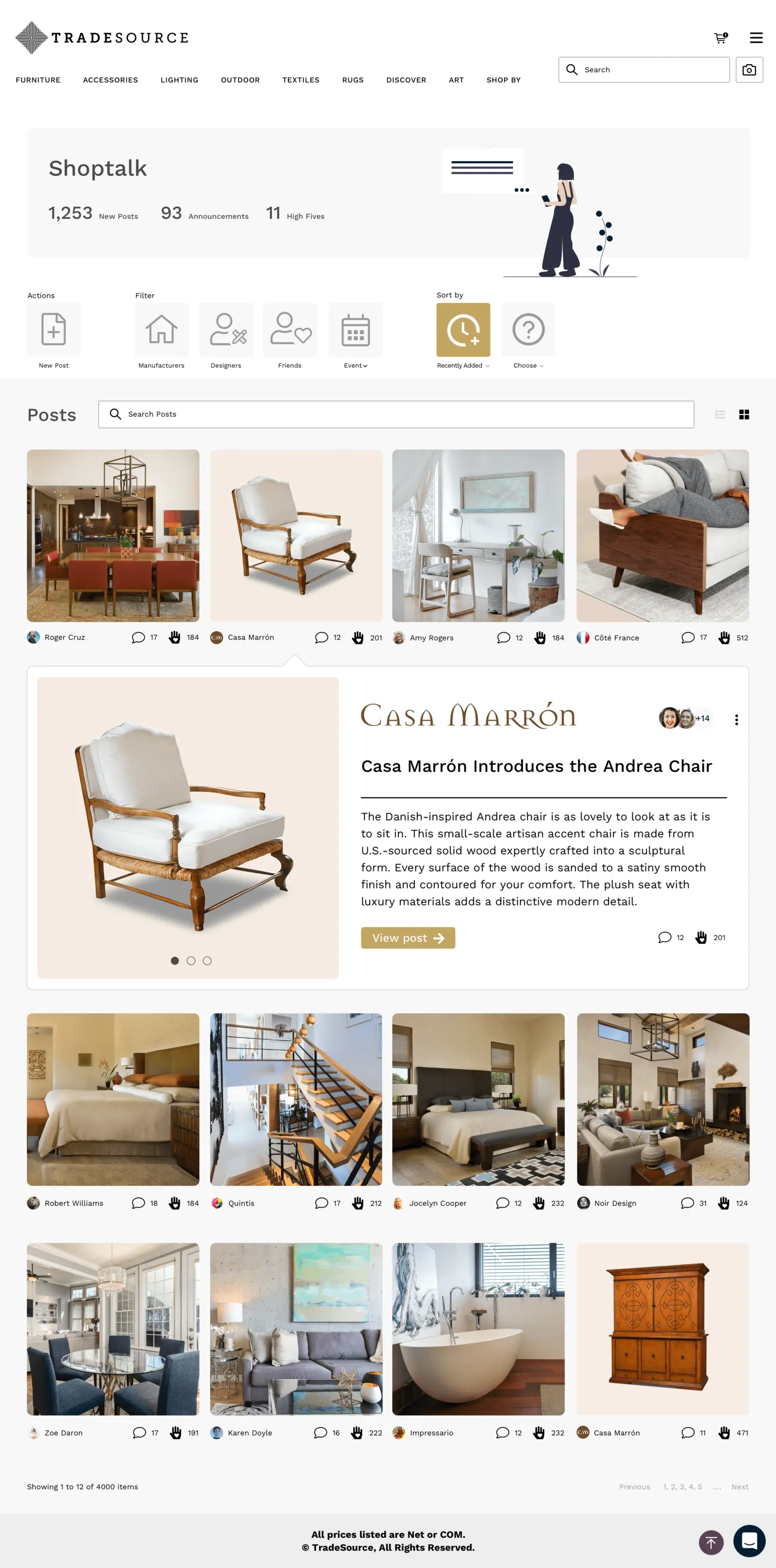
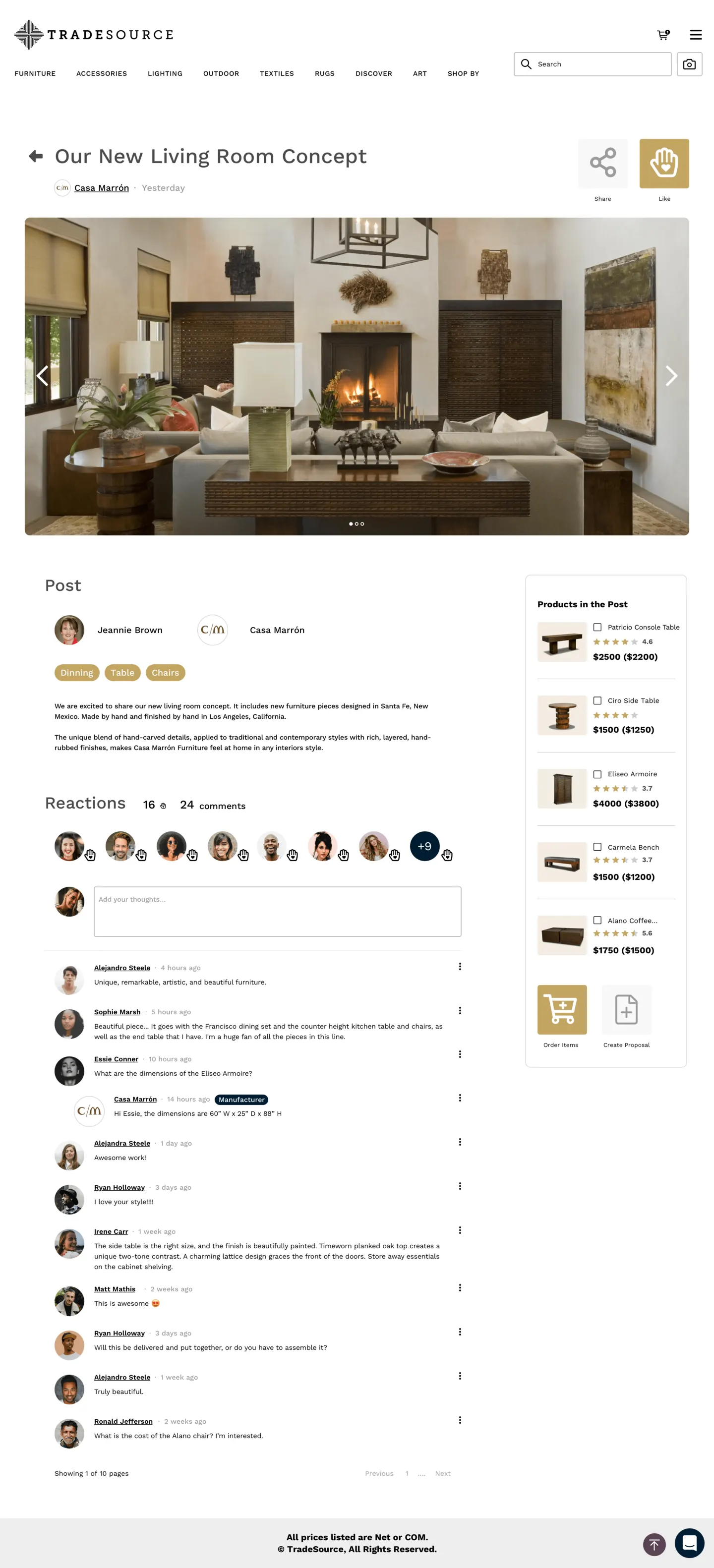
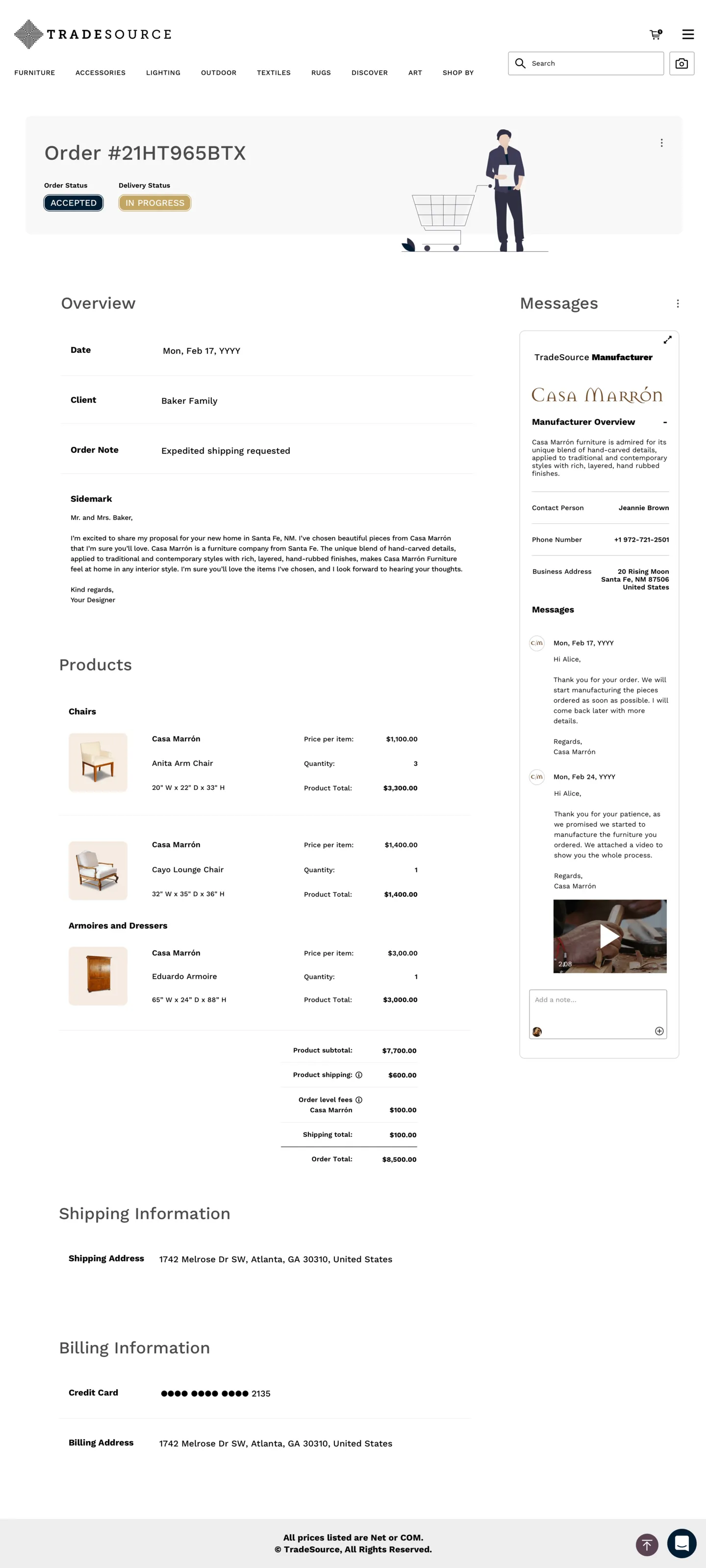
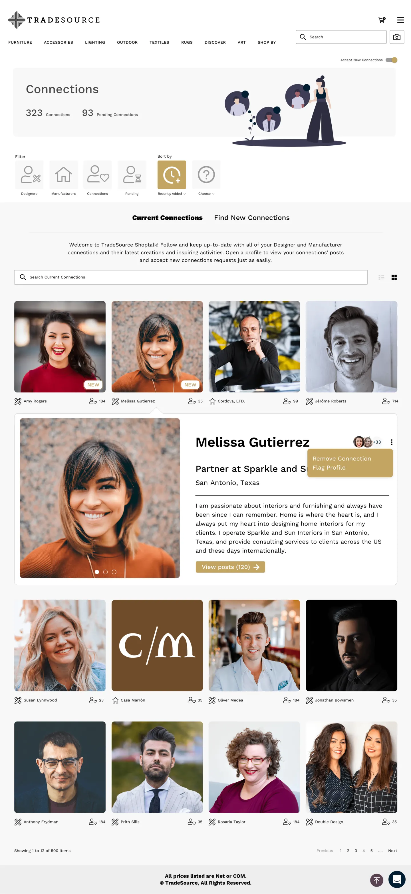
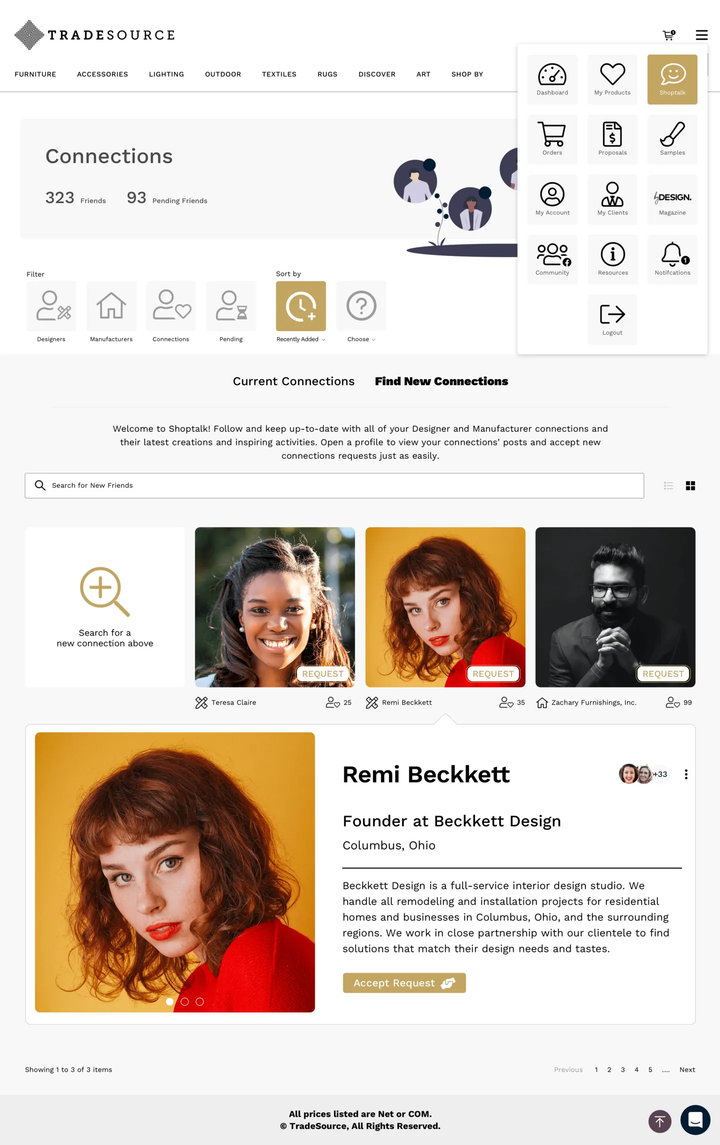
Desktop web, mobile web, and native iOS and Android — product detail, proposals, orders, connections, catalog management, and the ShopTalk social layer, all built on one design system.
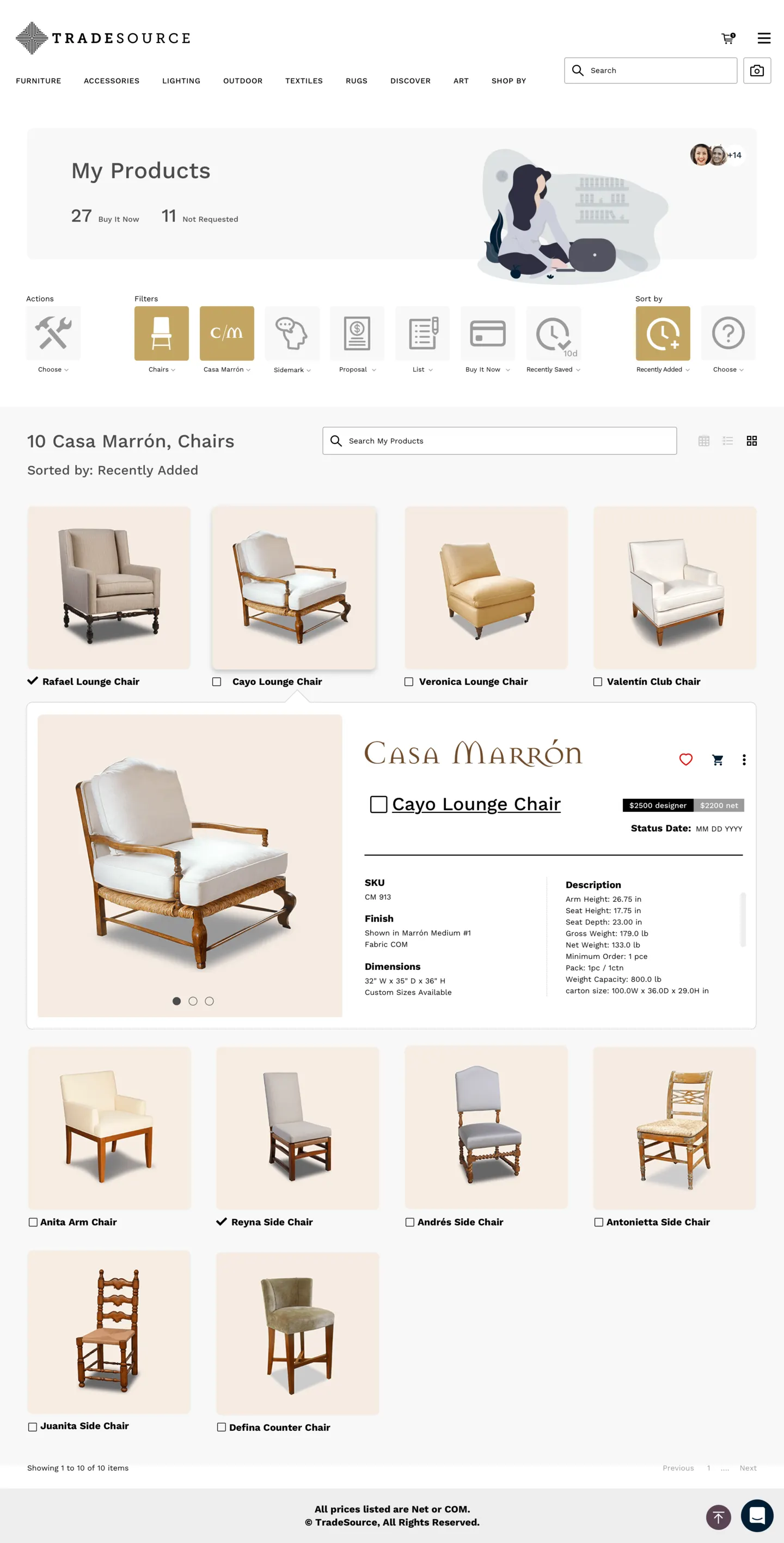
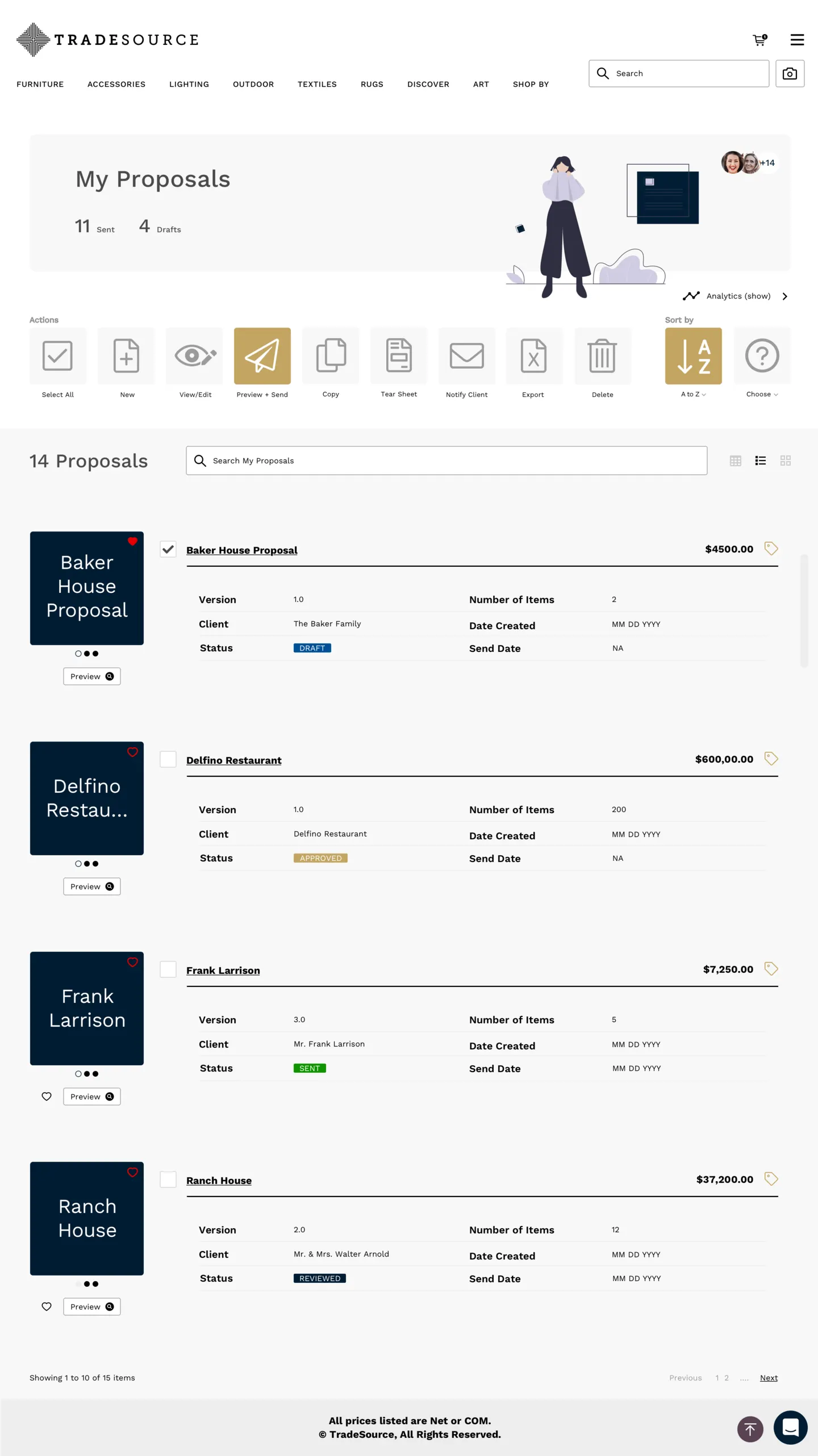
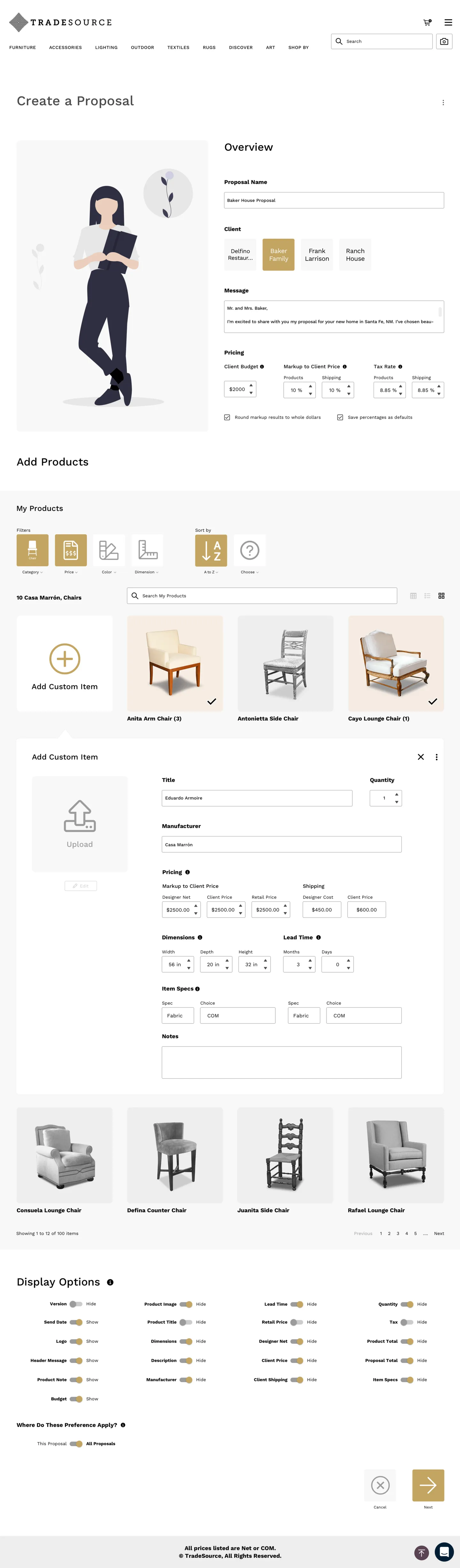
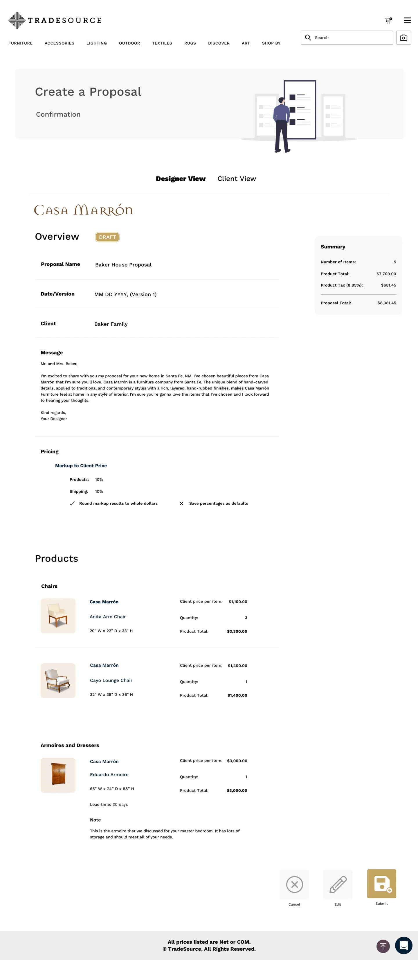
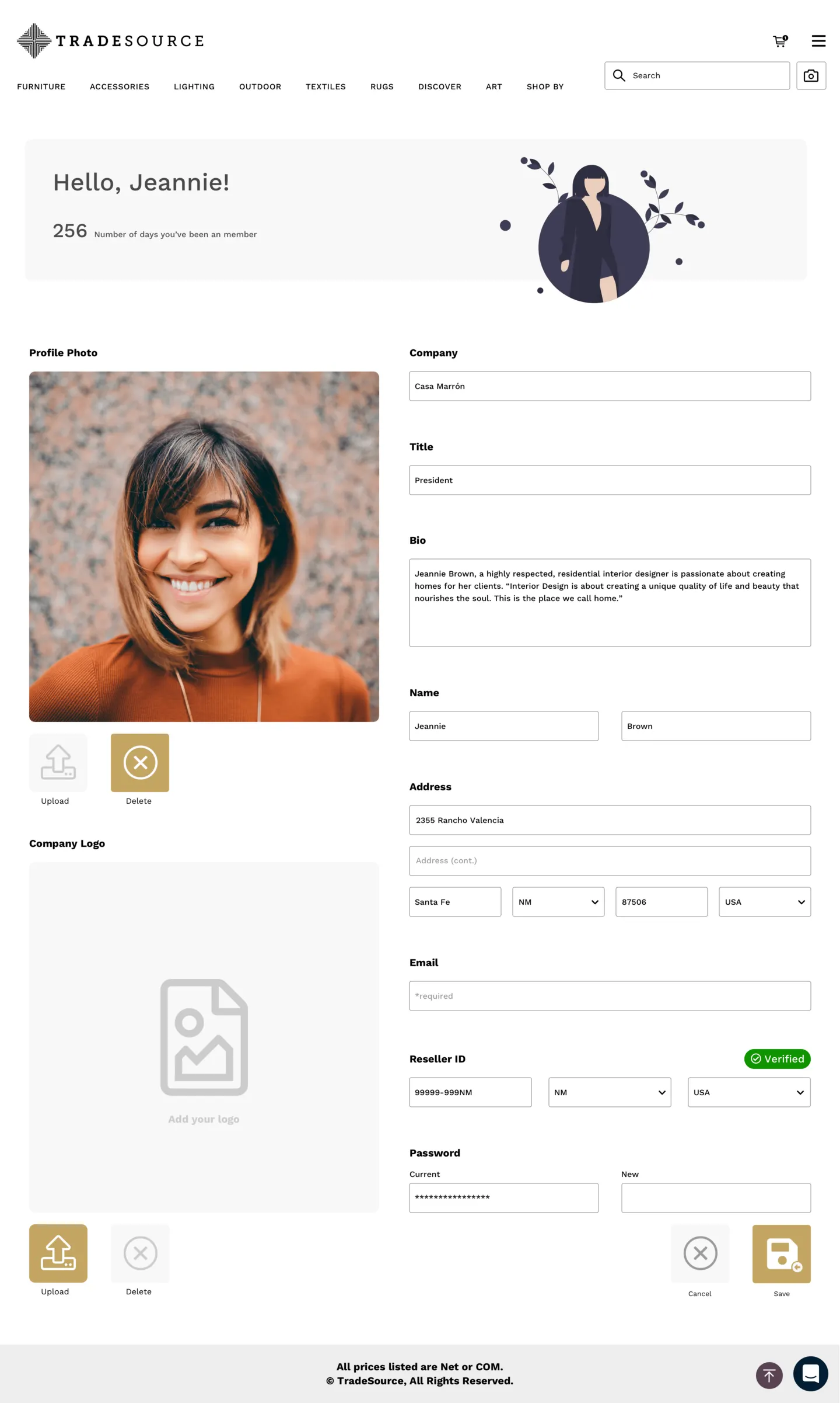
Desktop web — 16 full-length pages
Desktop web
Fifteen pages, edge to edge
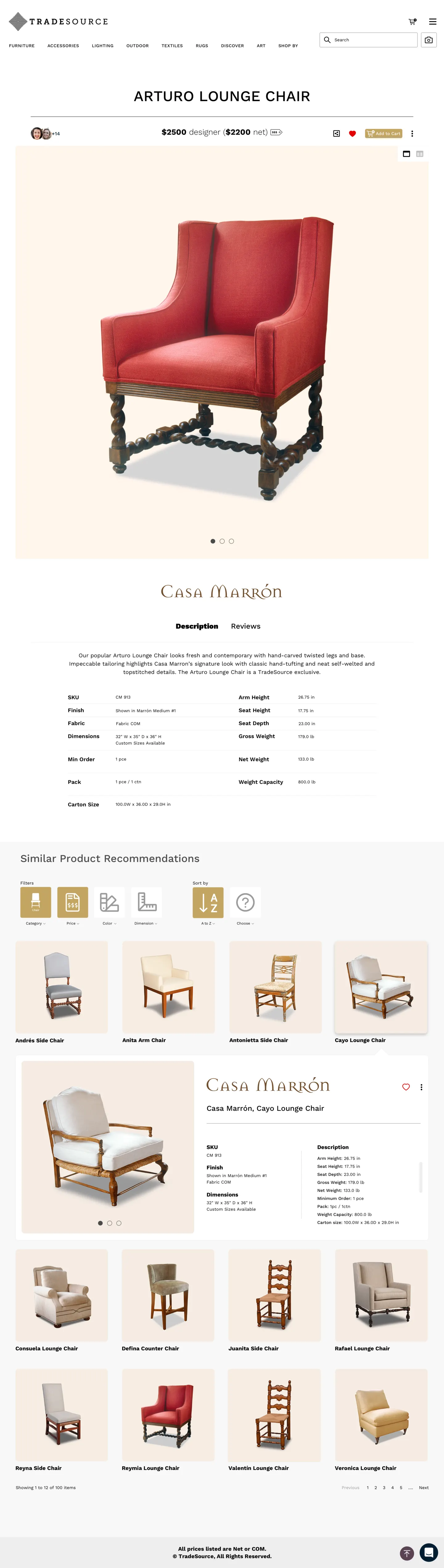
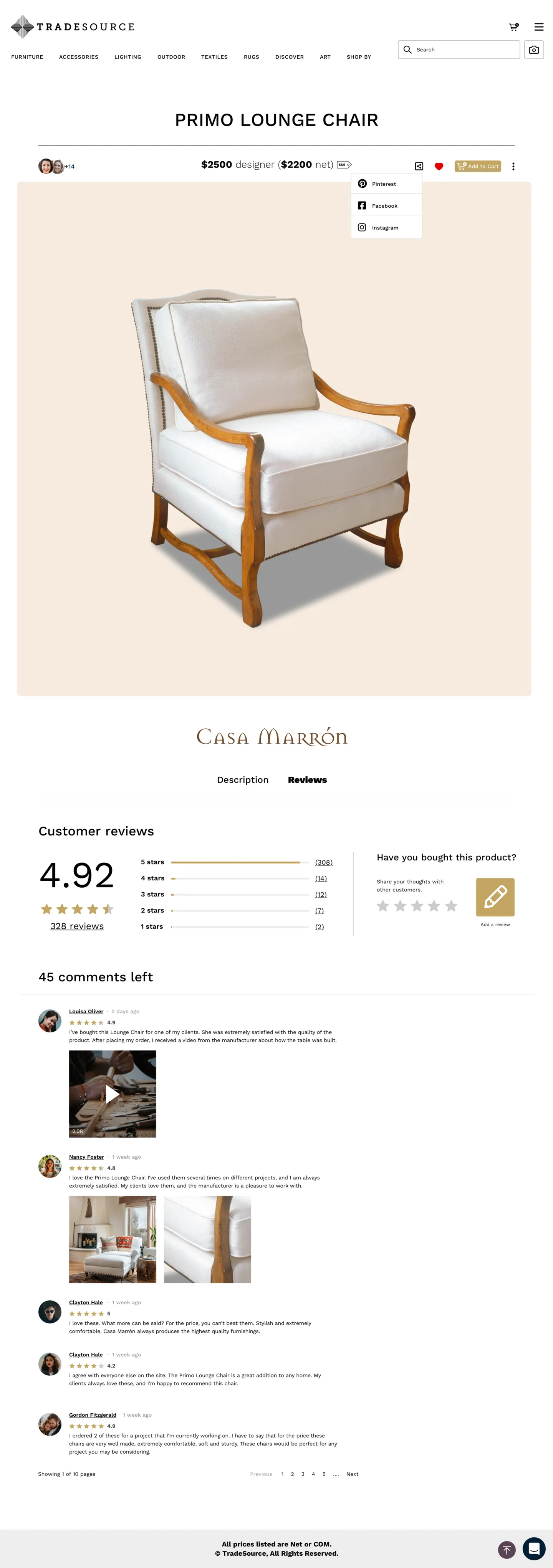
The complete desktop surface — product detail through proposals, ShopTalk, orders, connections, and profile. The featured page scrolls end to end; hover any other card to travel its full length.
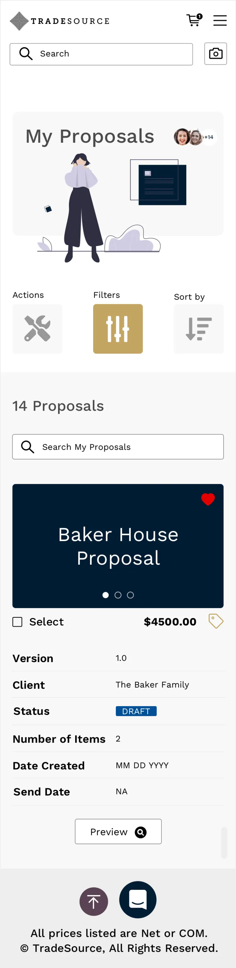
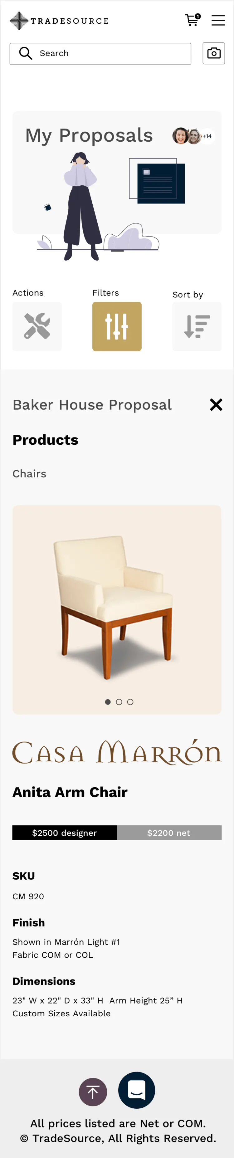
Mobile web
Sixteen pages in the pocket
The same ecosystem compressed to a phone browser — all sixteen pages cycling through four devices.














Native apps
Fifty screens, five phones
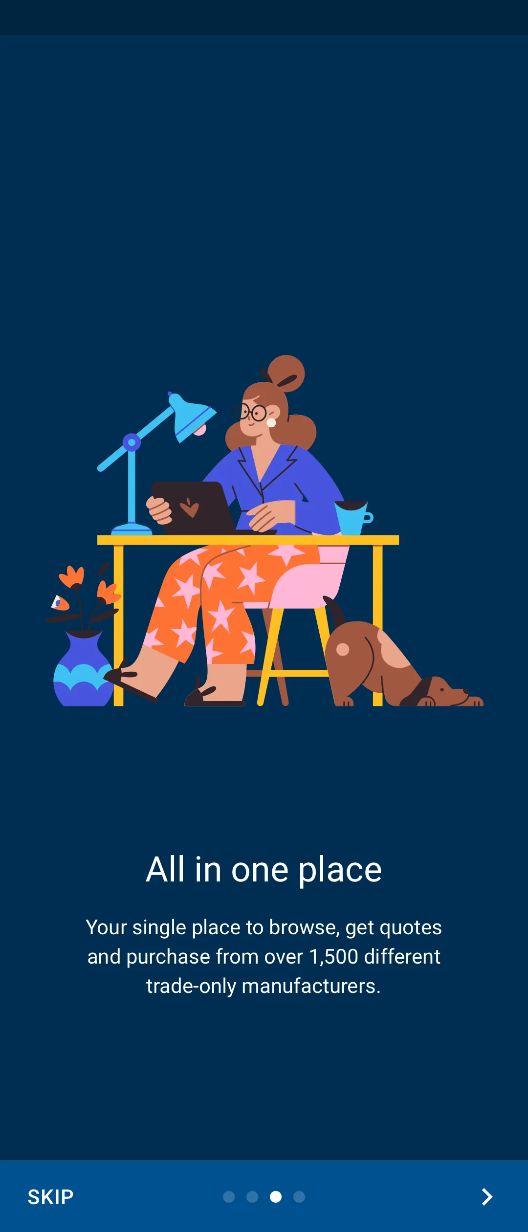
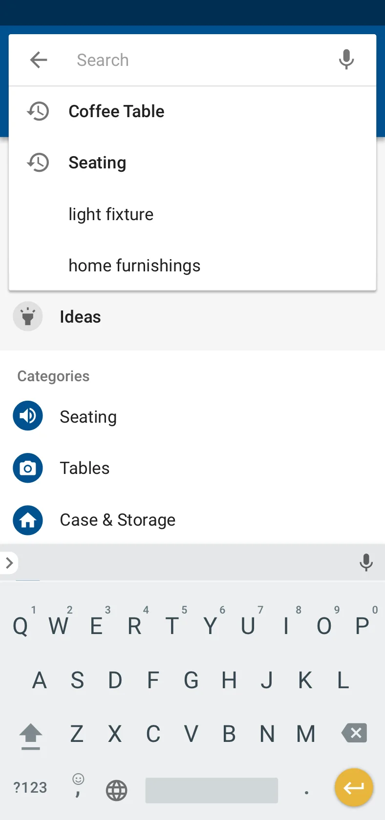
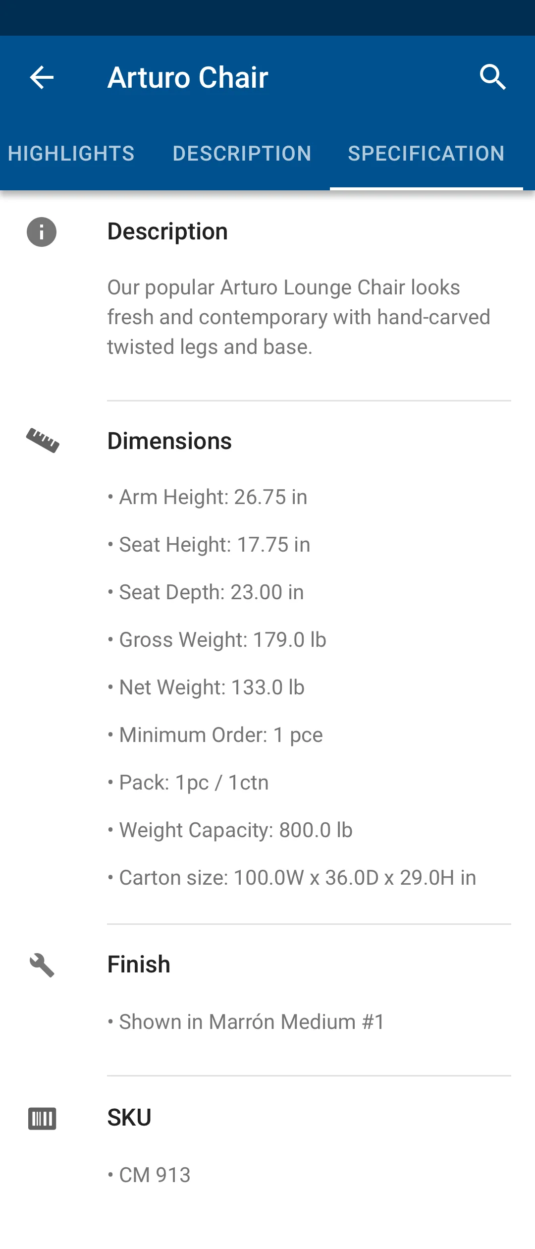
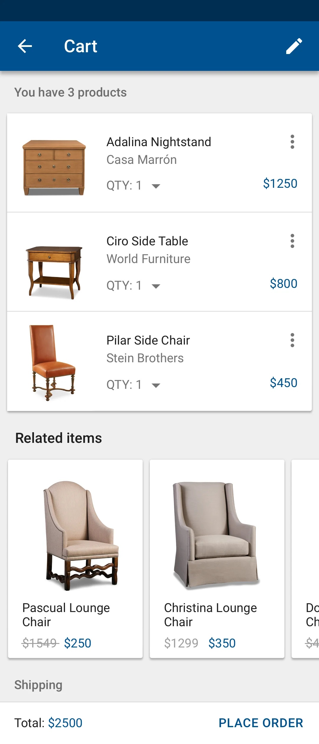
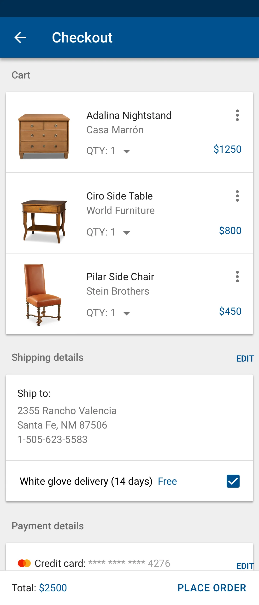
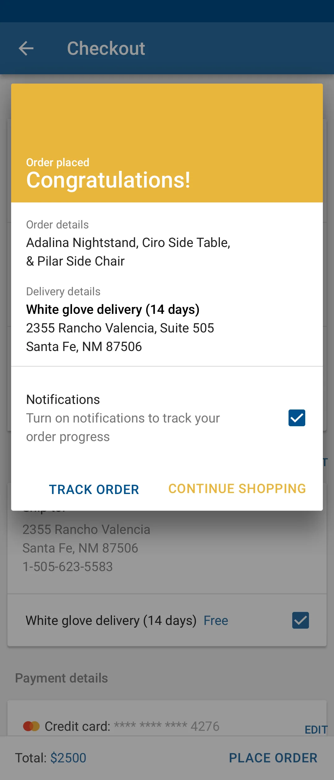
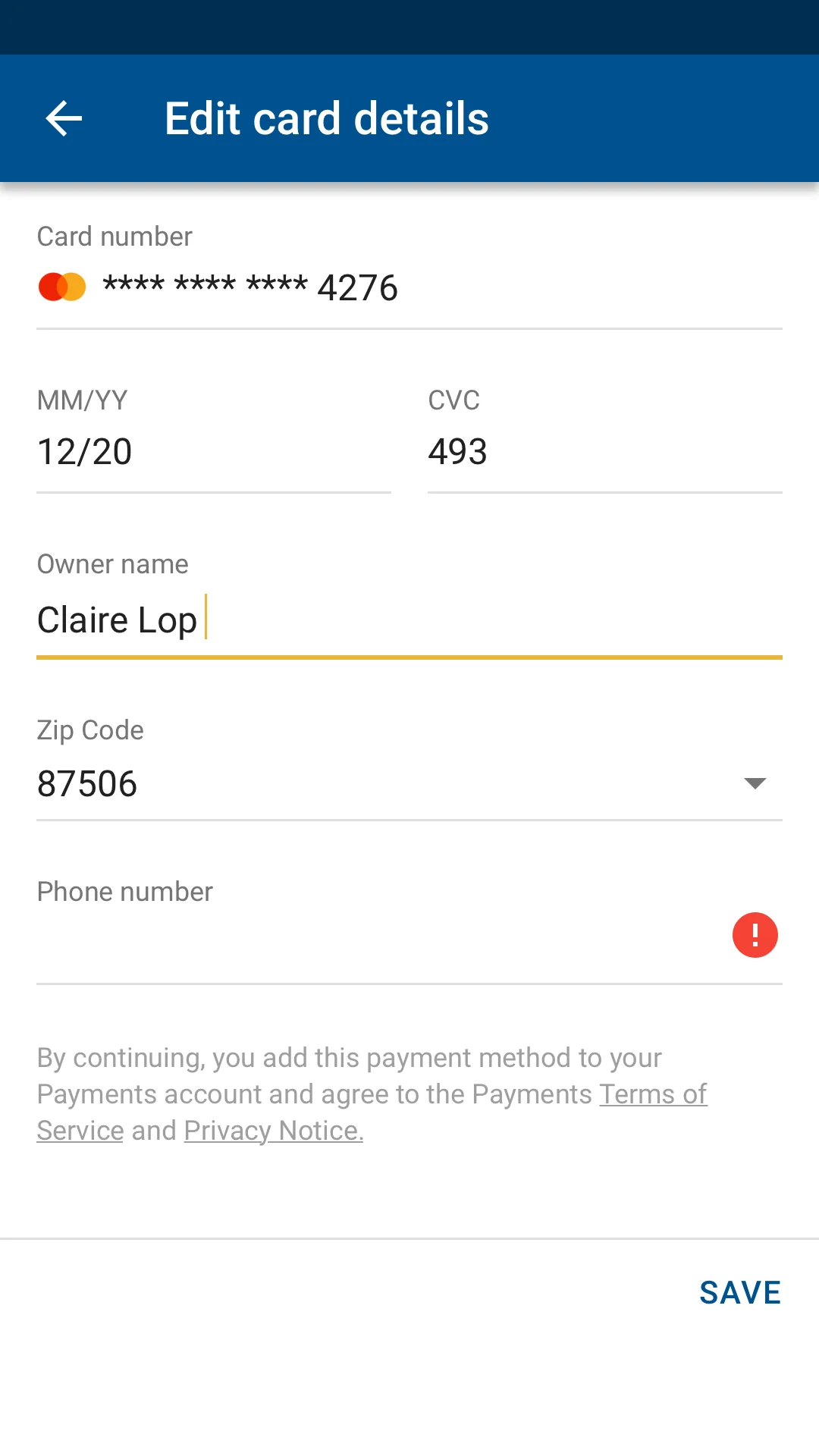
The full iOS click-through and the Android shopping flow, cycling through five devices — product discovery, proposals, ShopTalk, catalog management, and checkout.
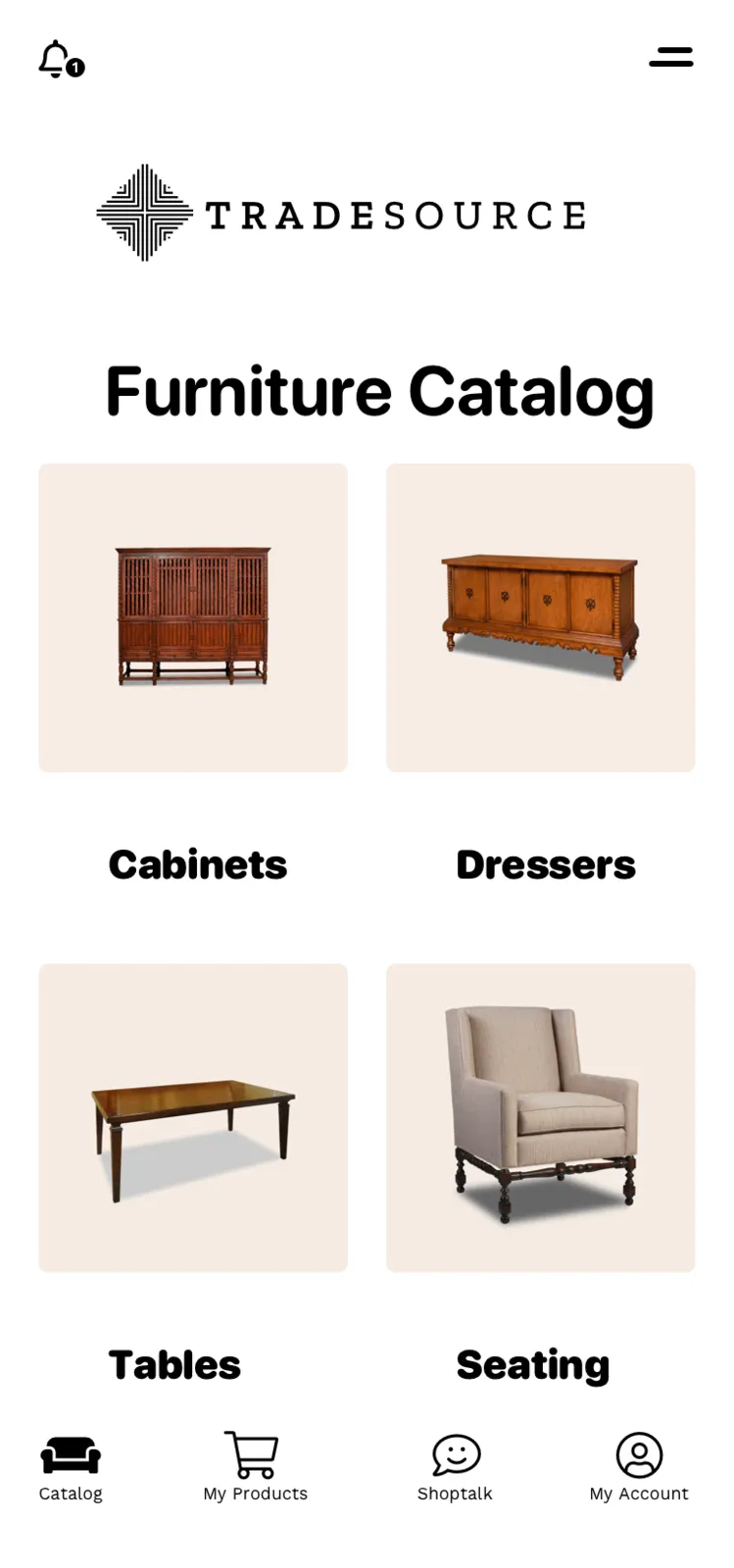
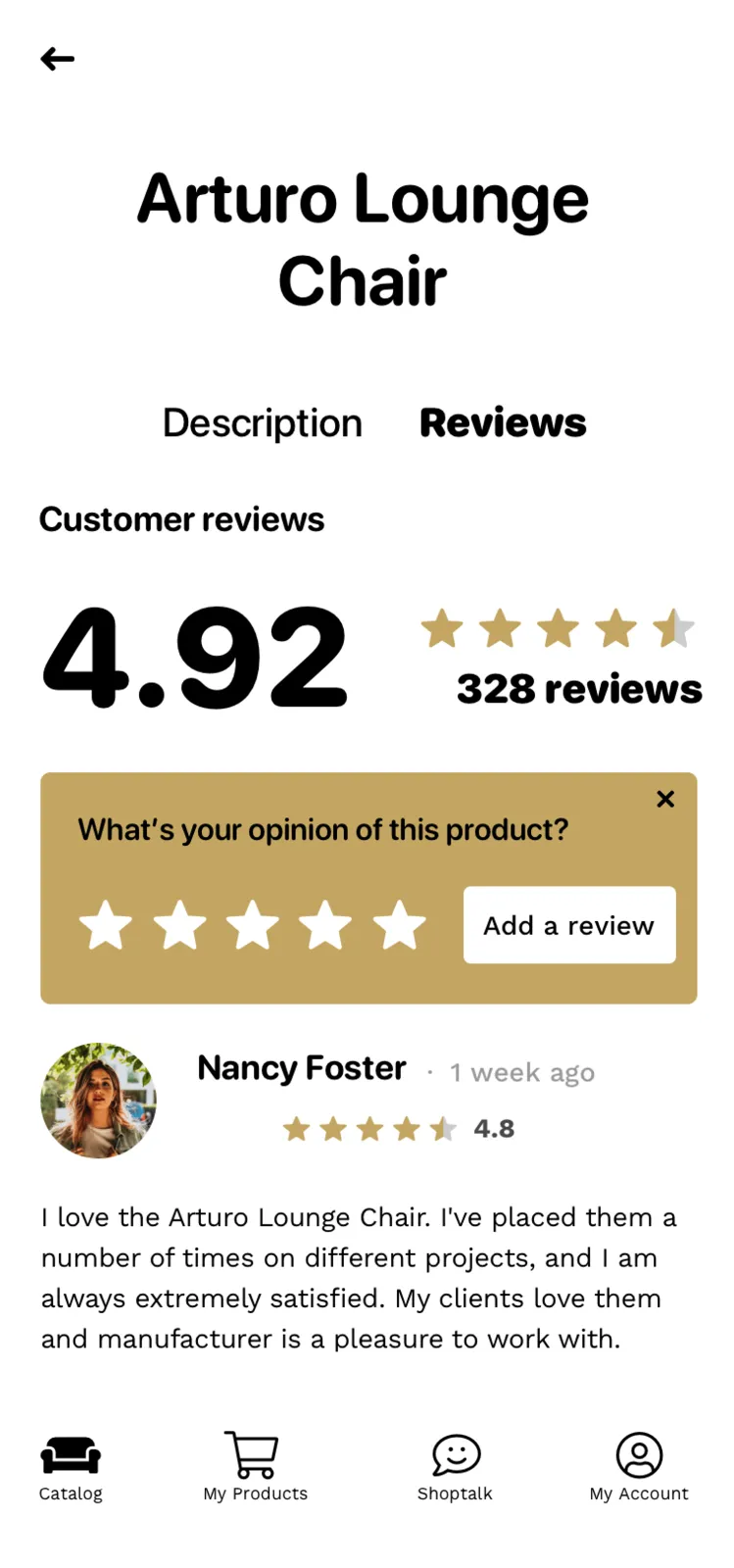
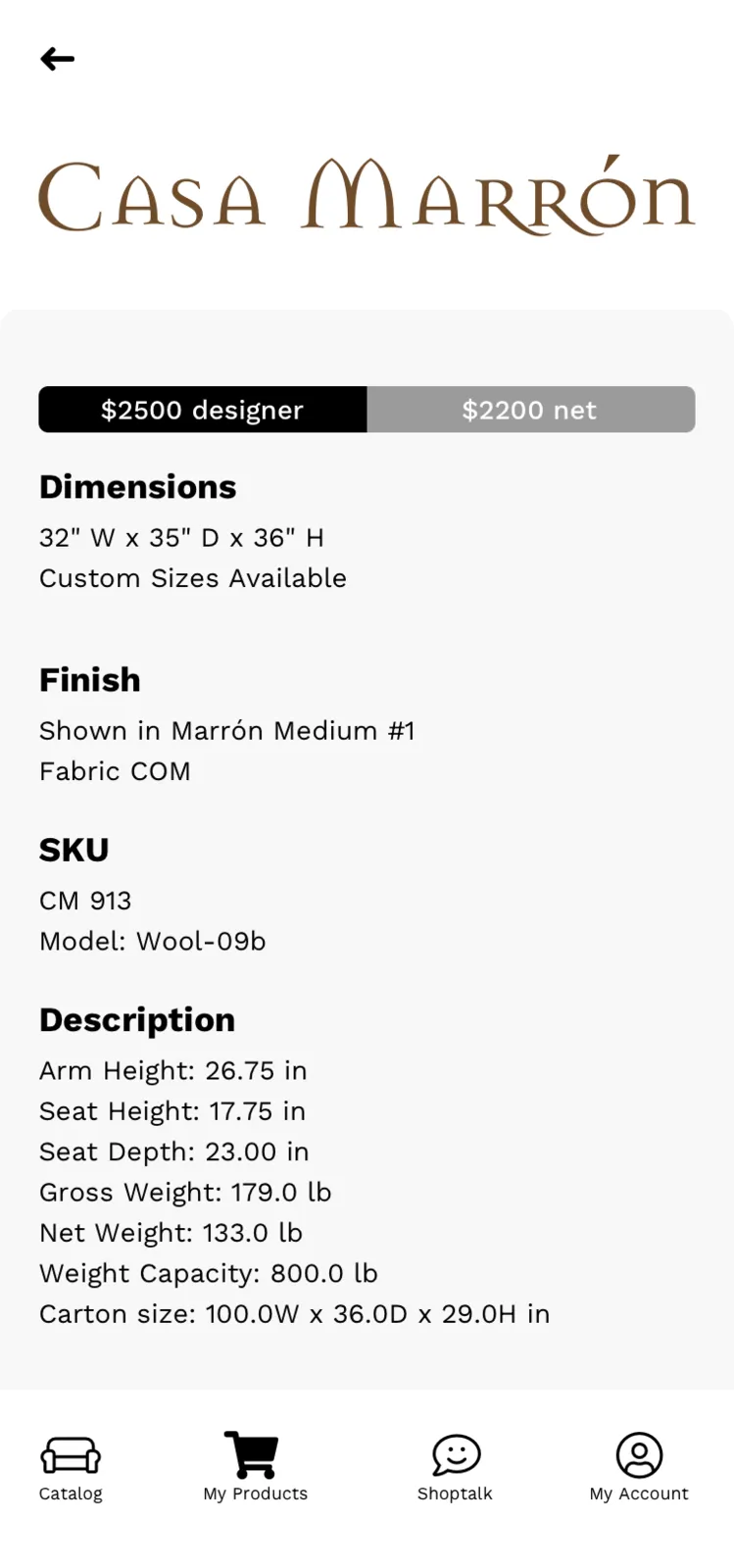
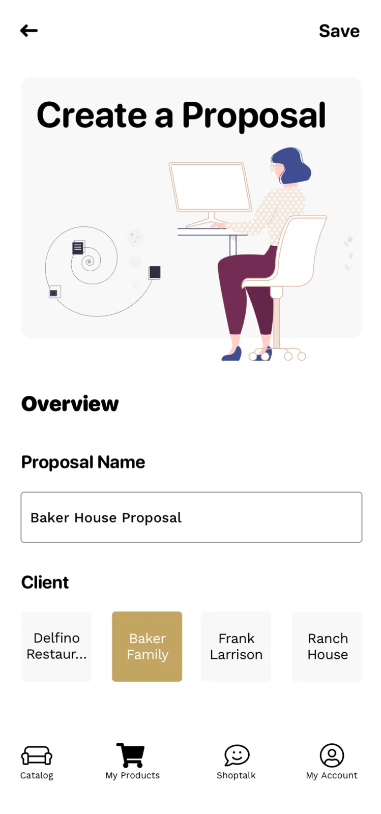
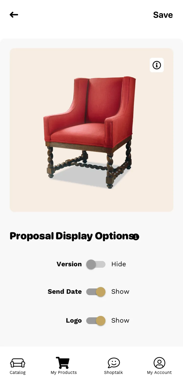
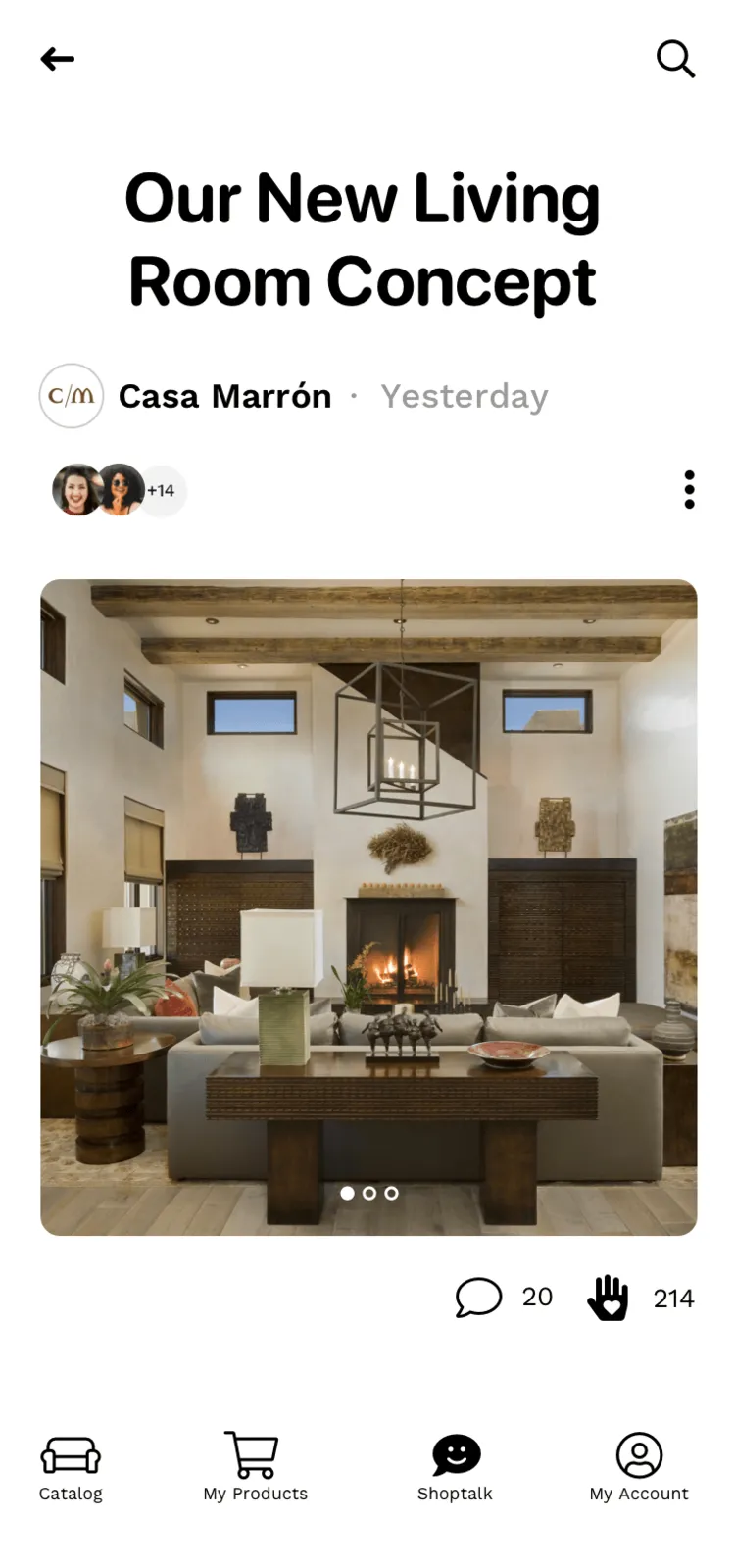
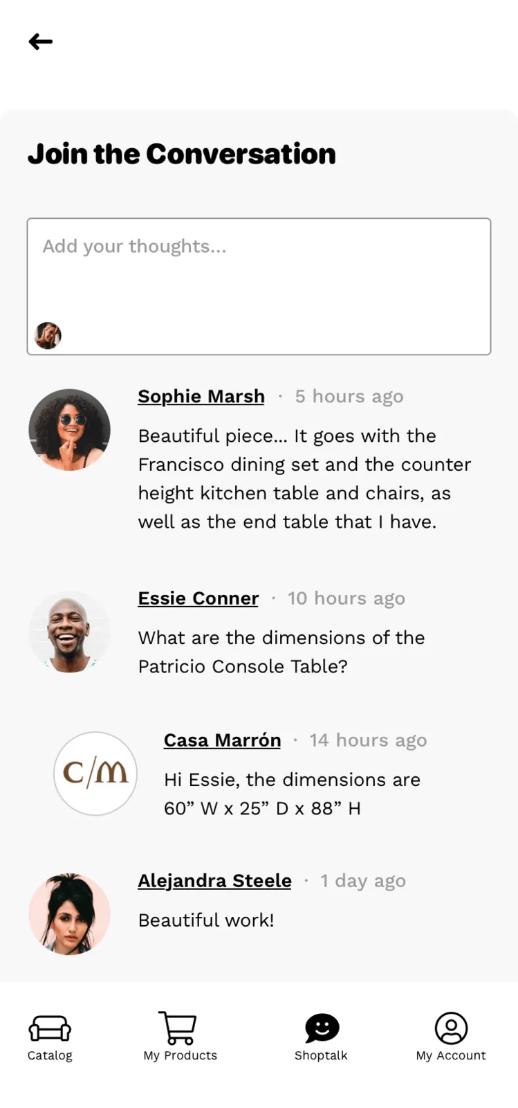
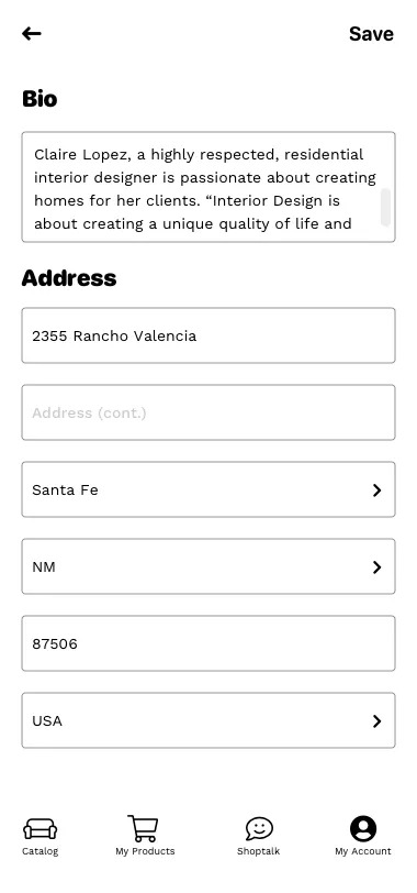
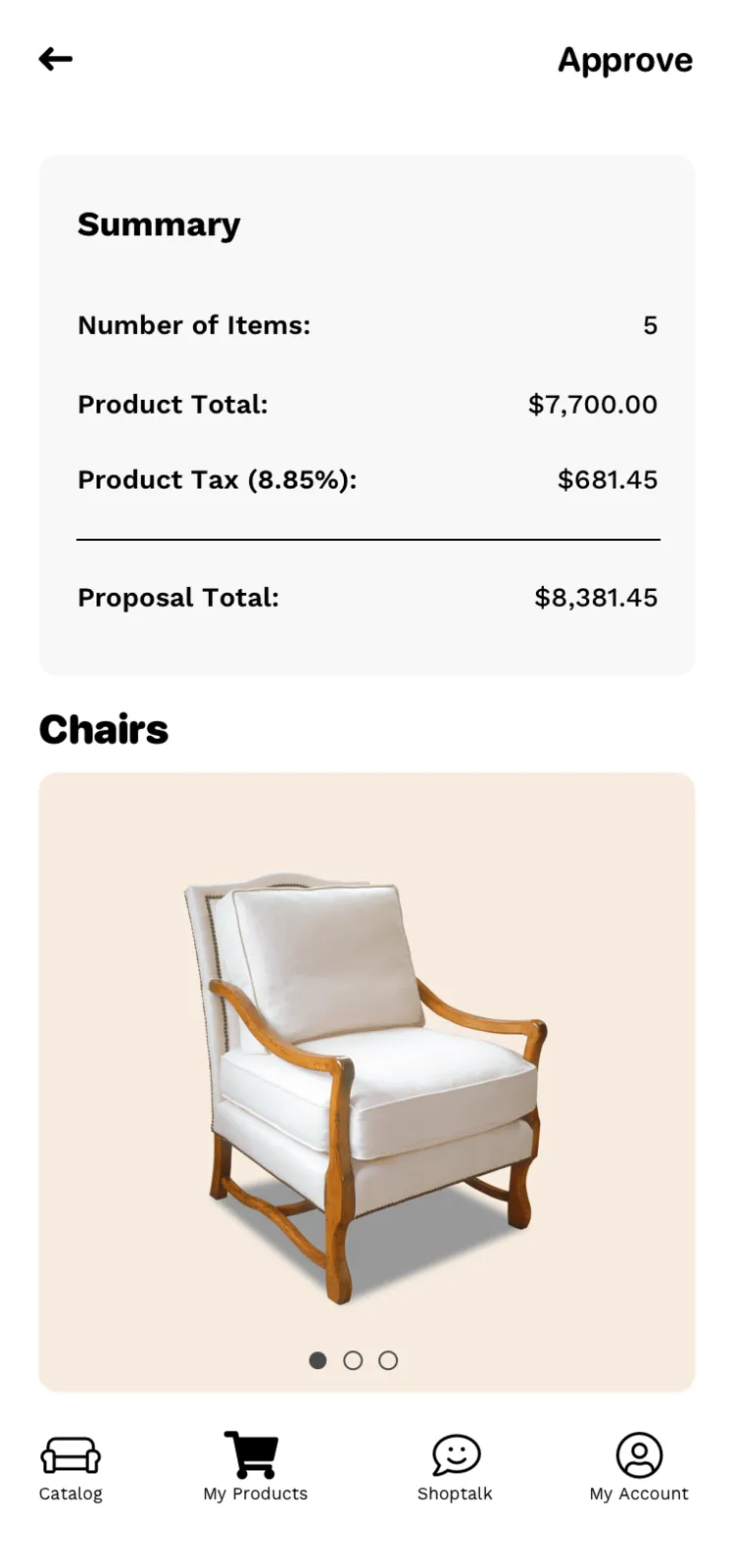
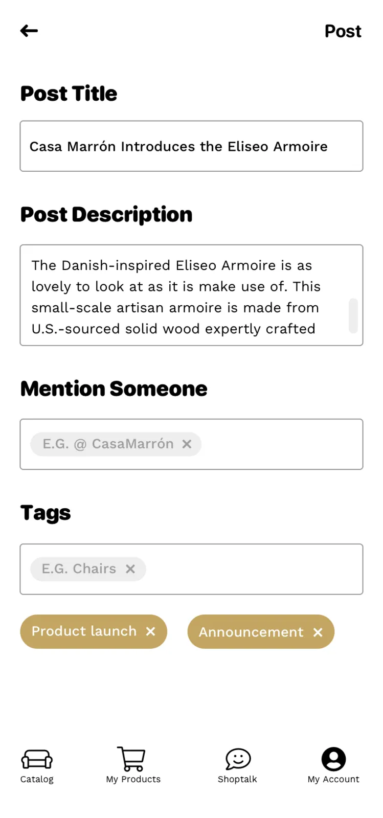
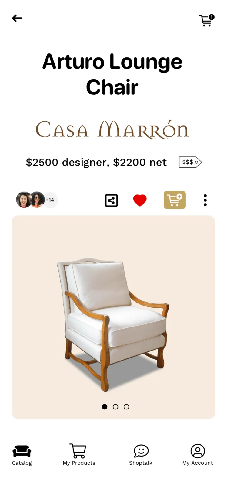
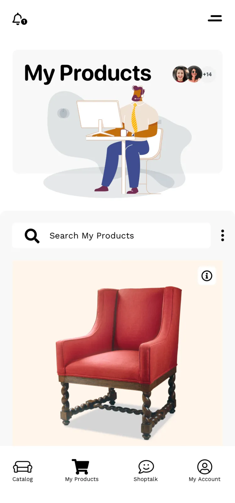
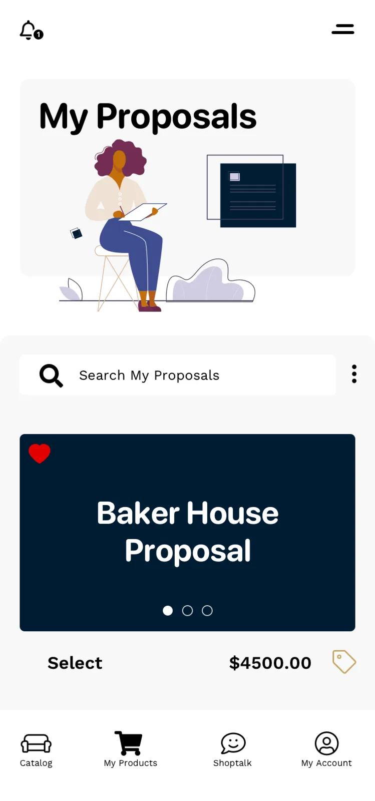
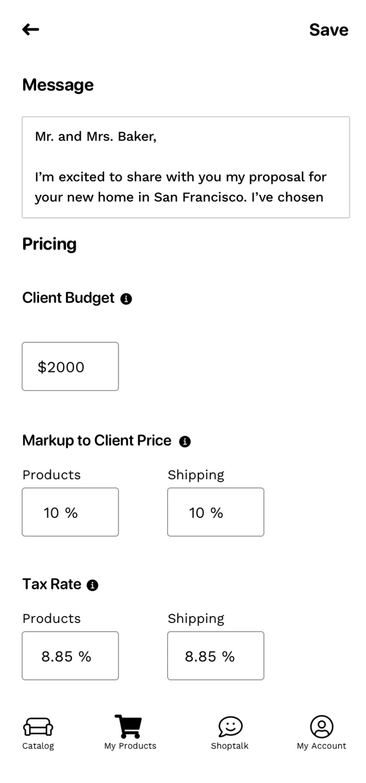
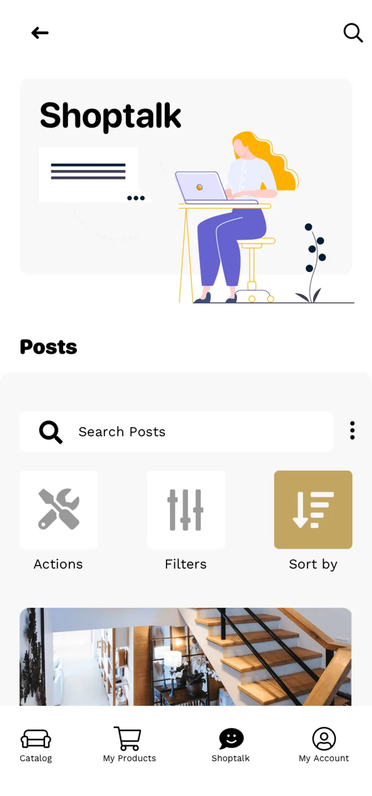
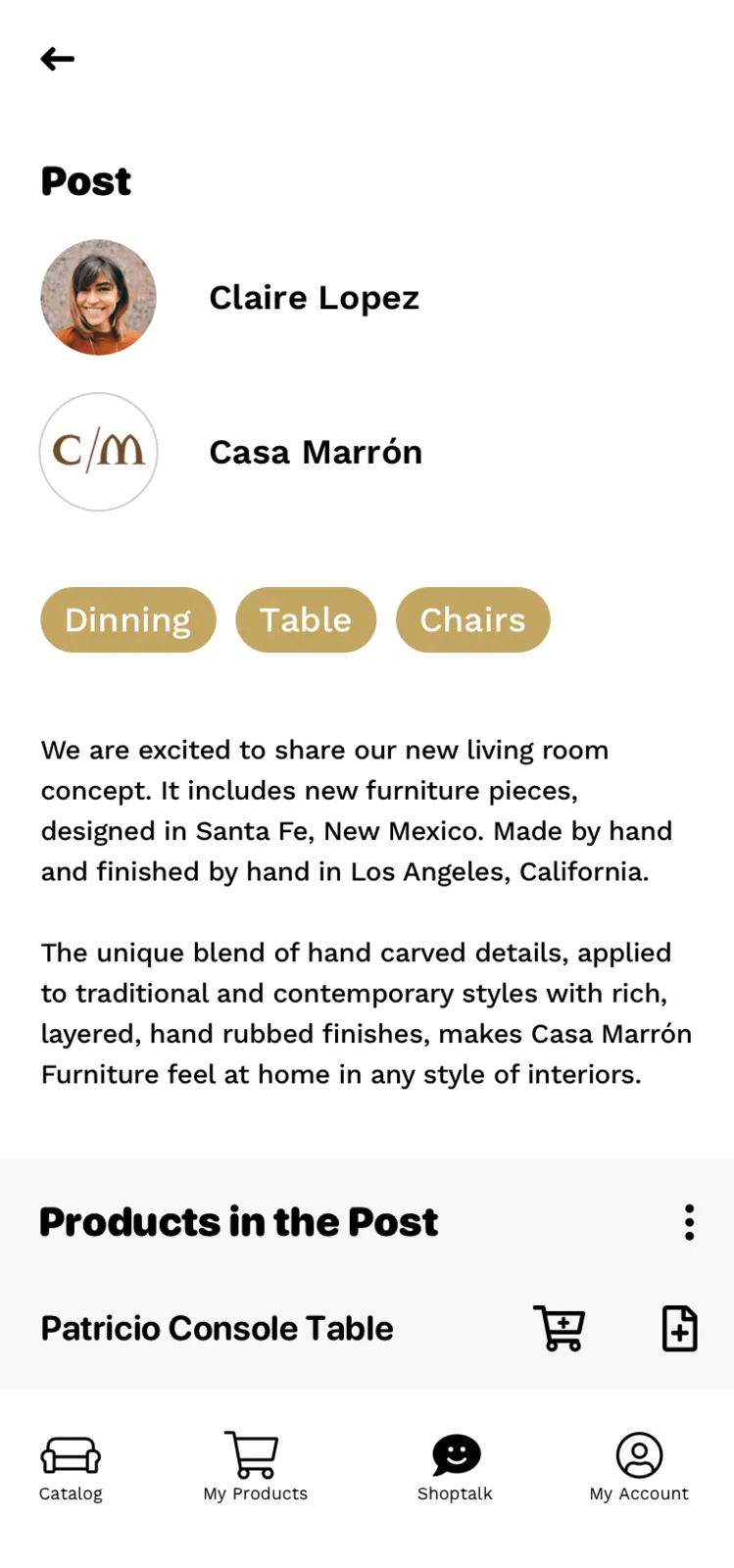

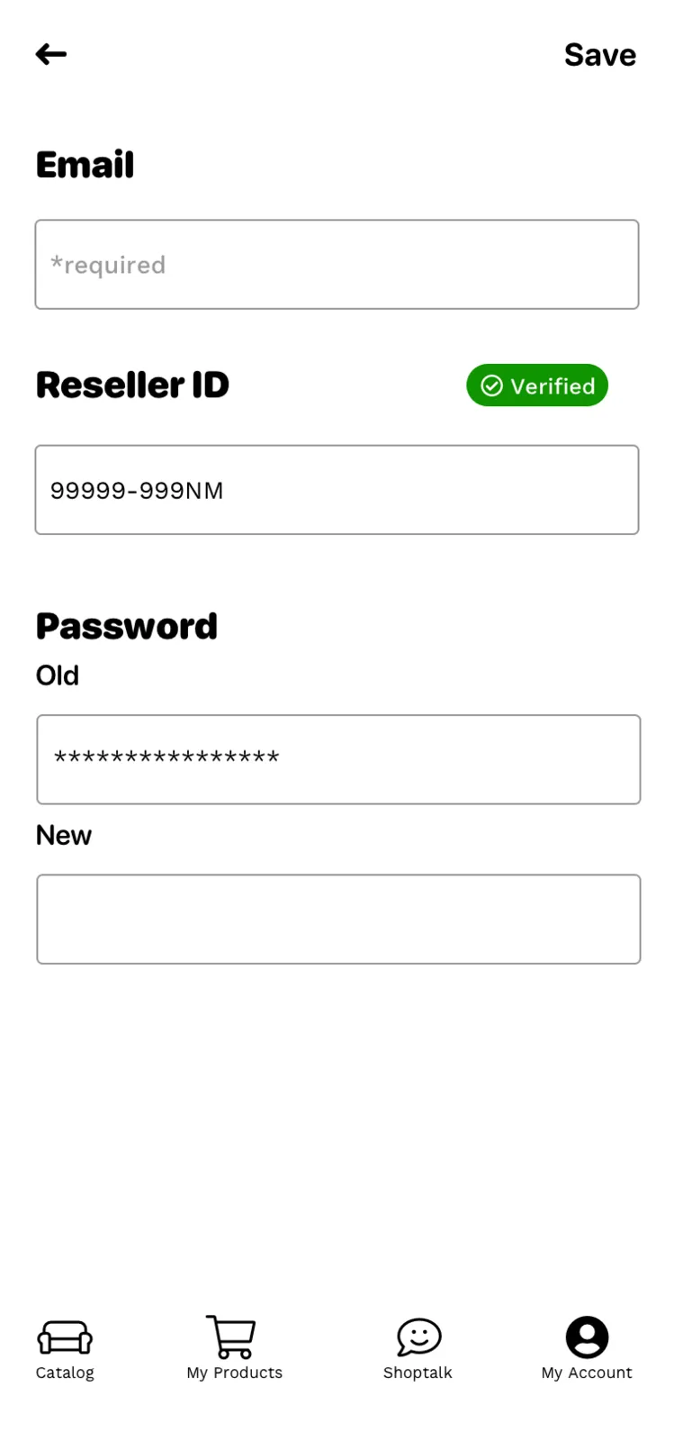
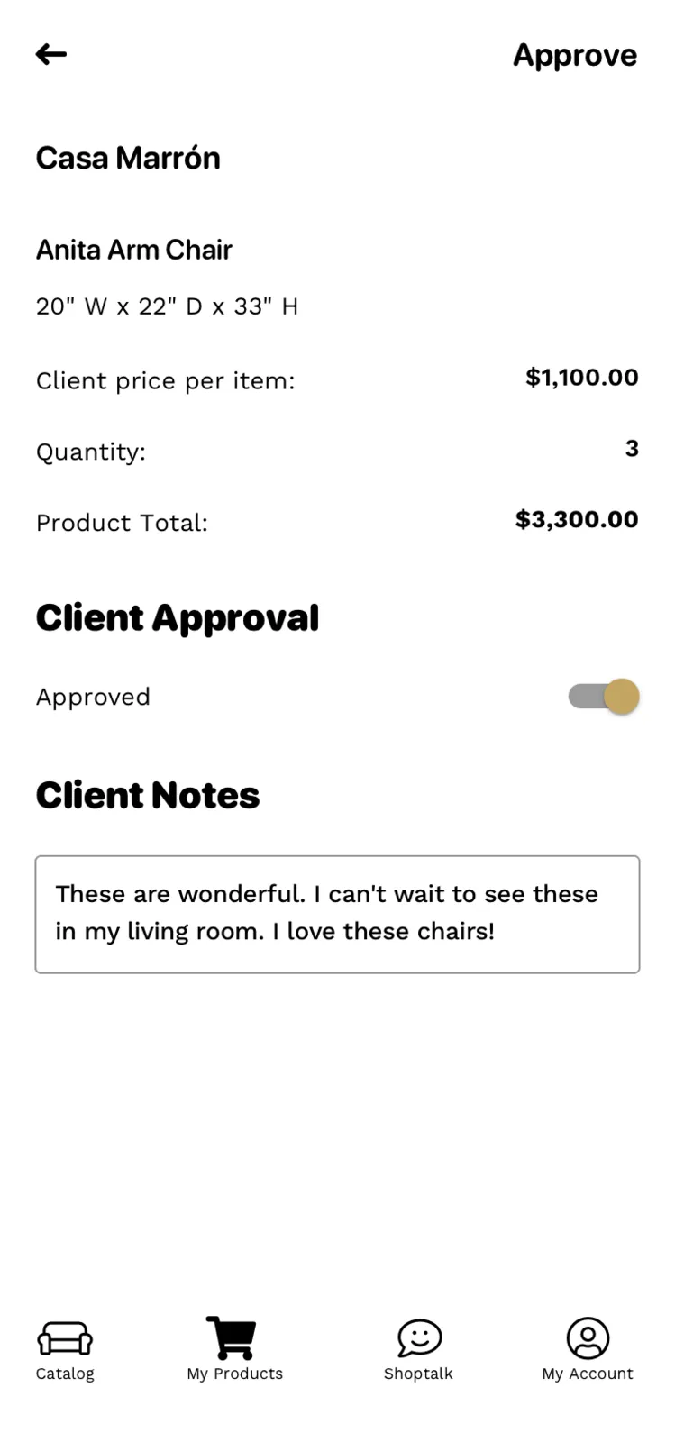
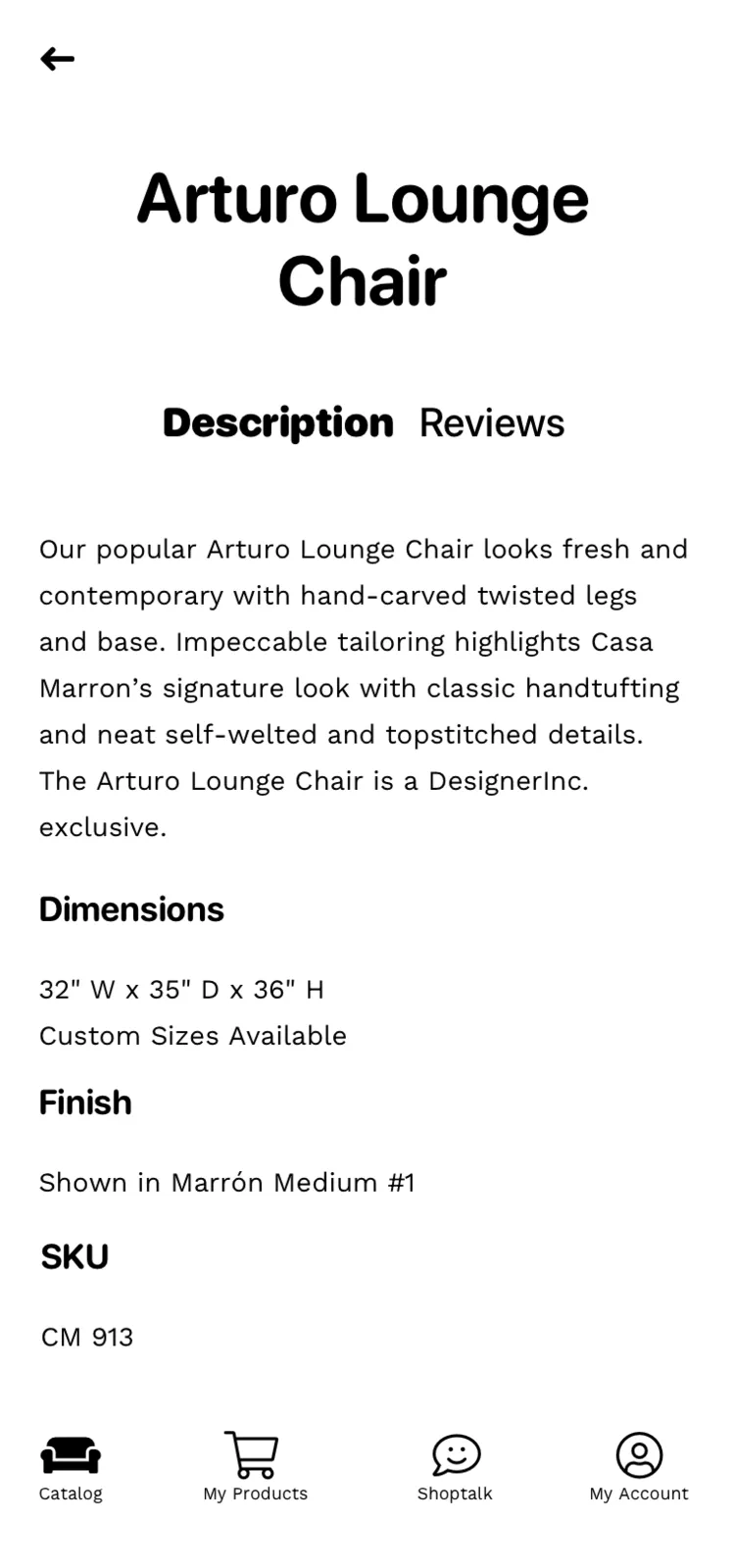
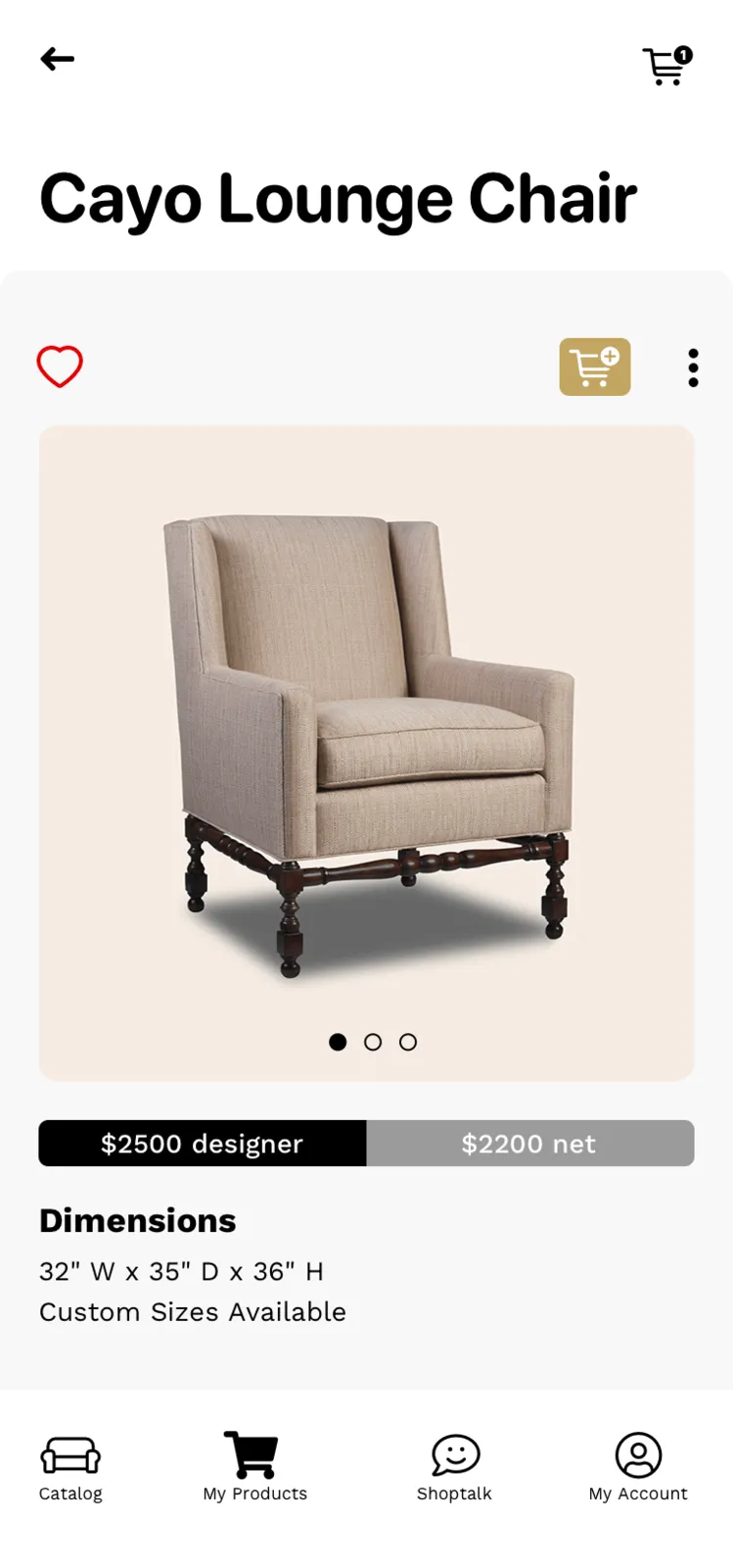
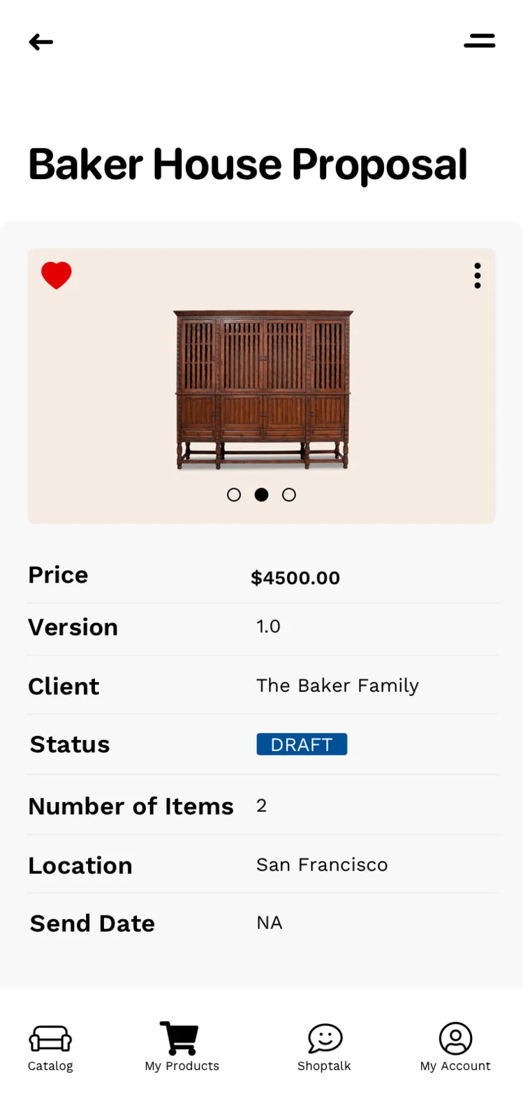
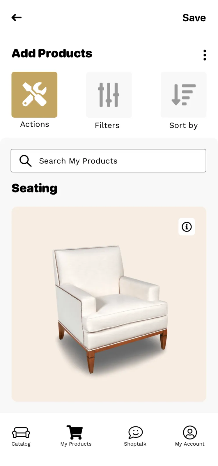
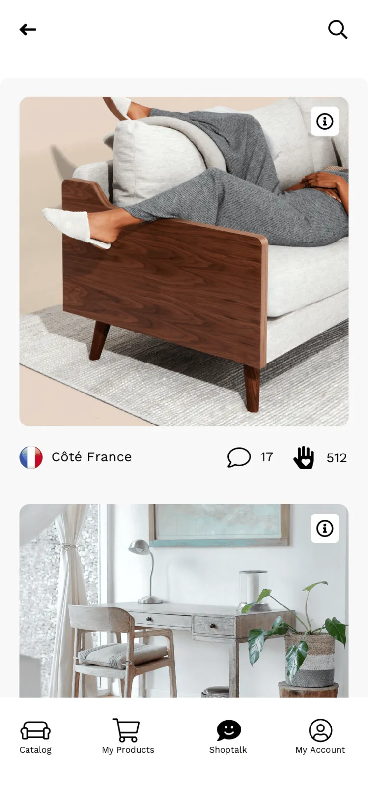
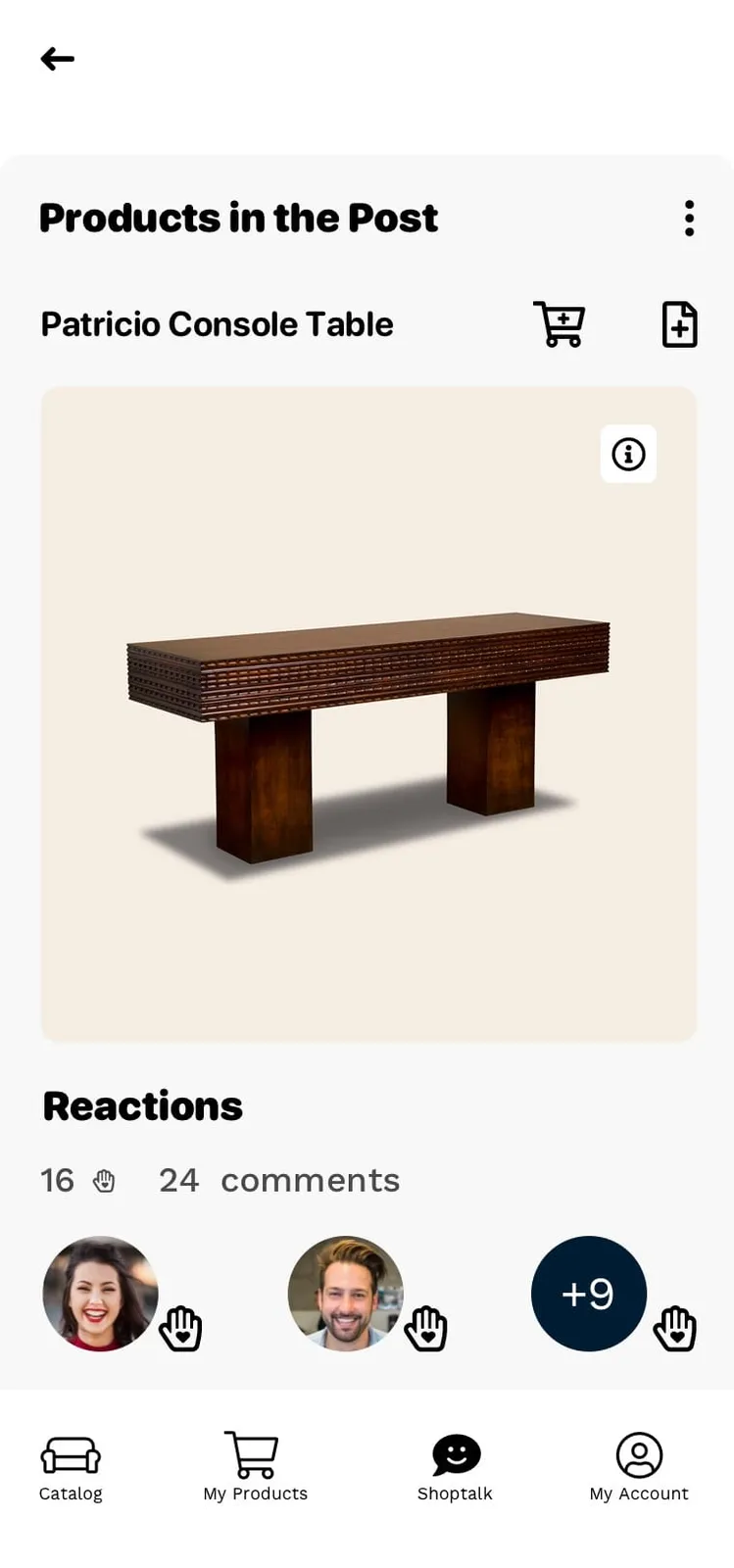
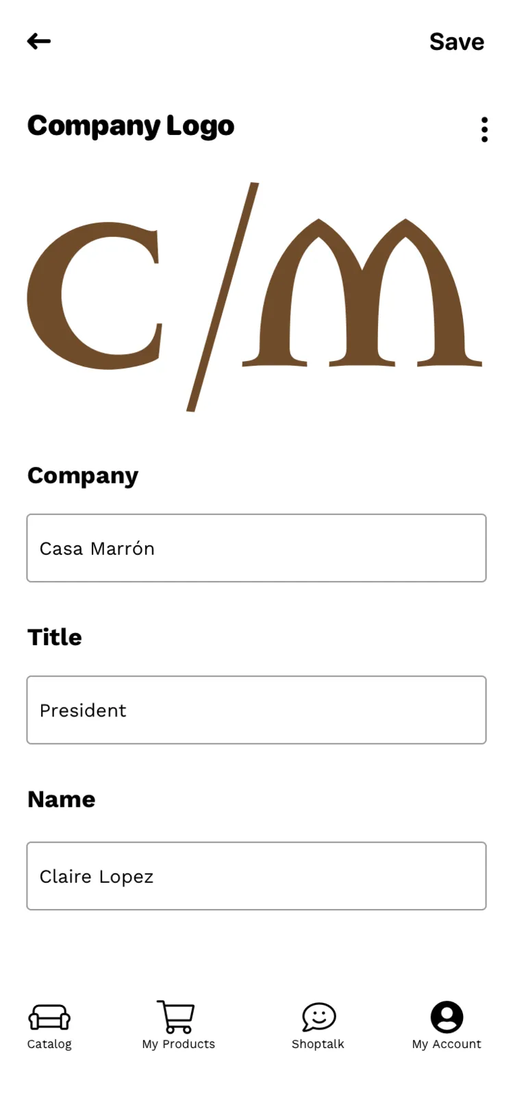
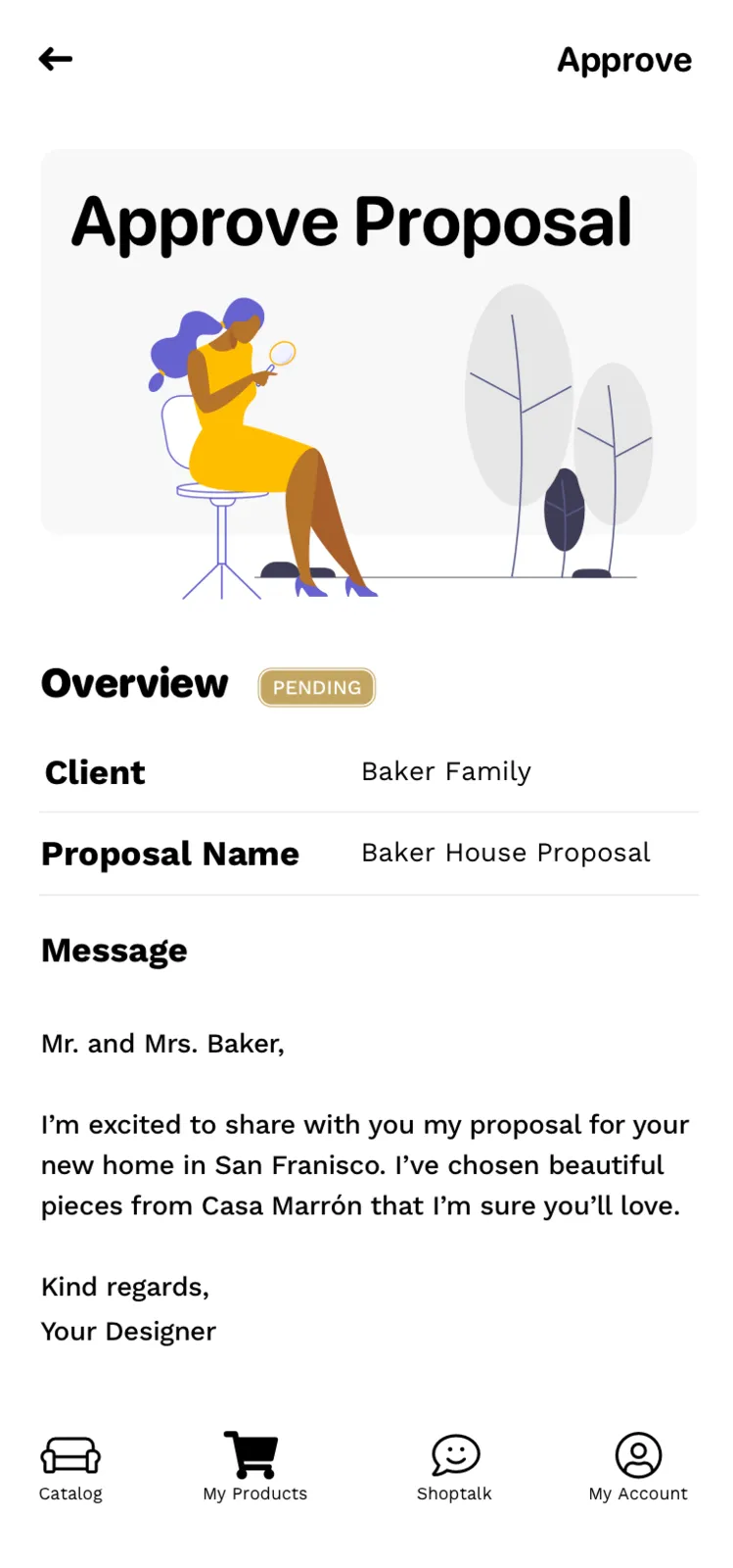
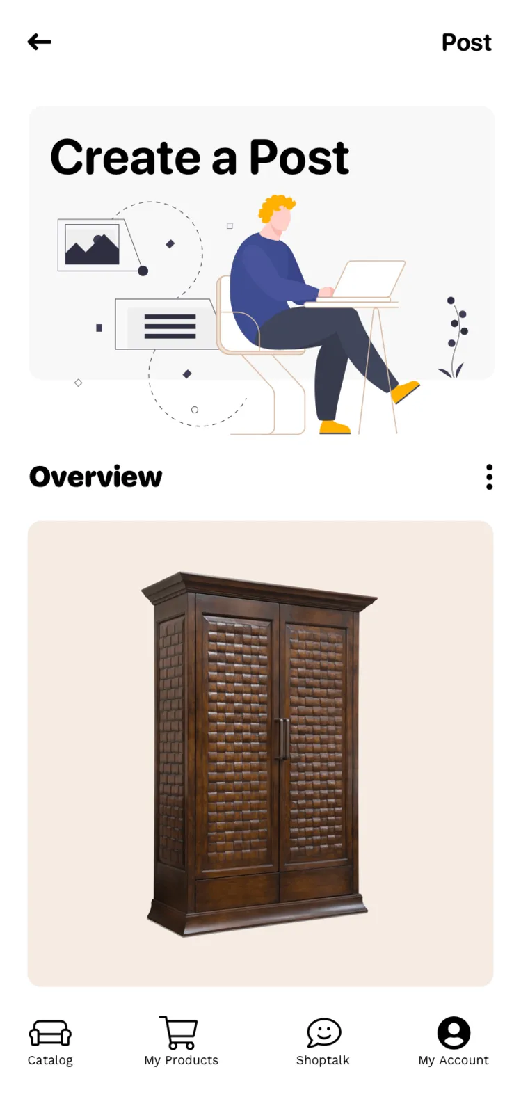


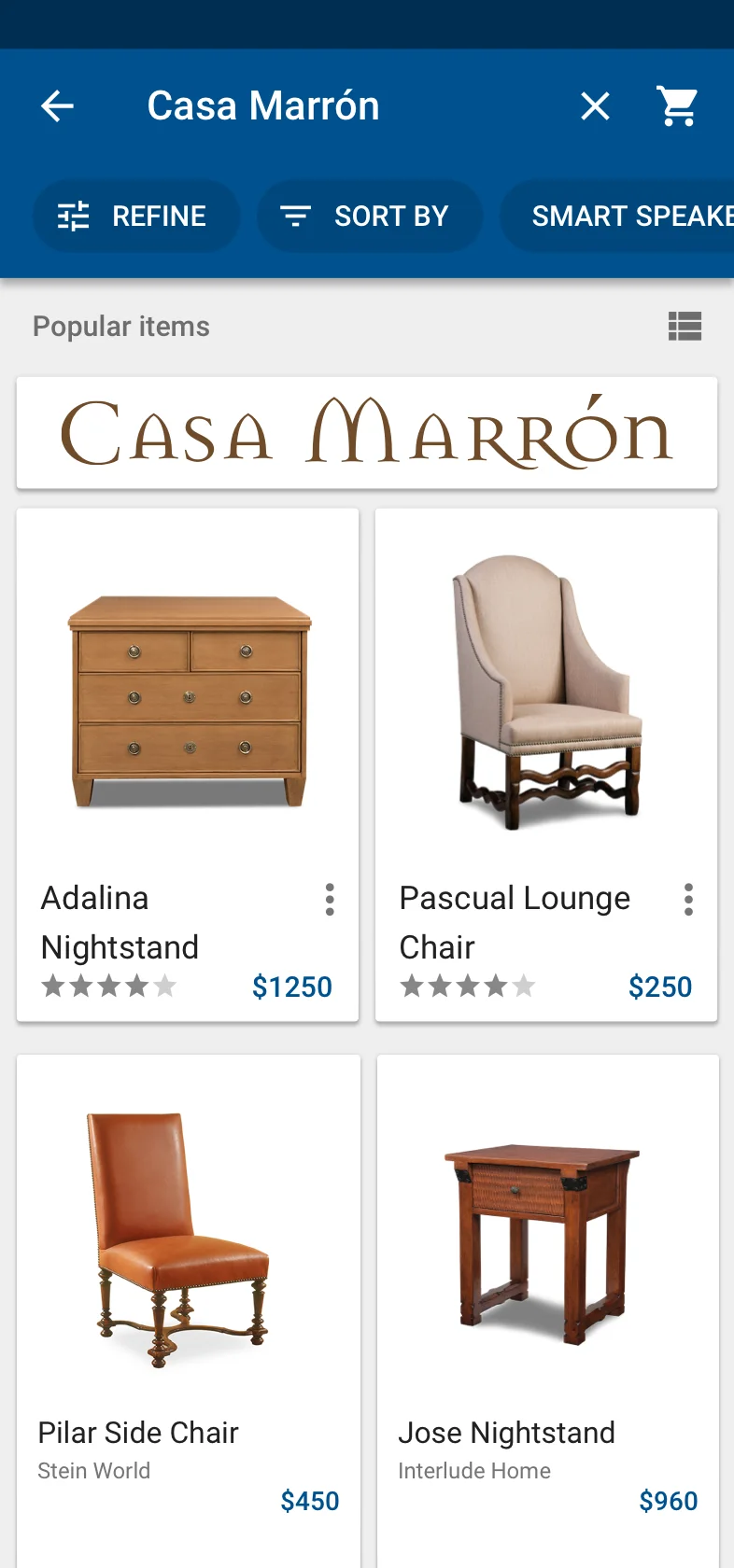

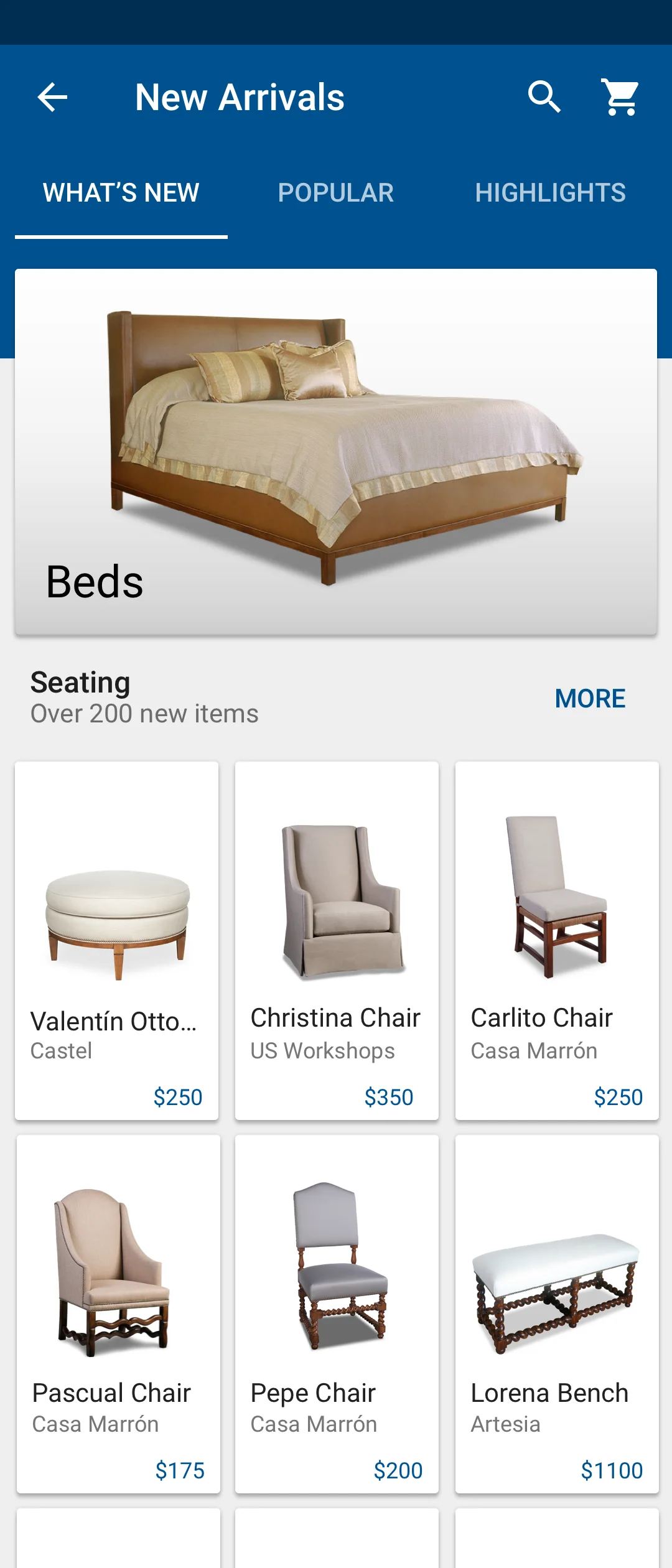
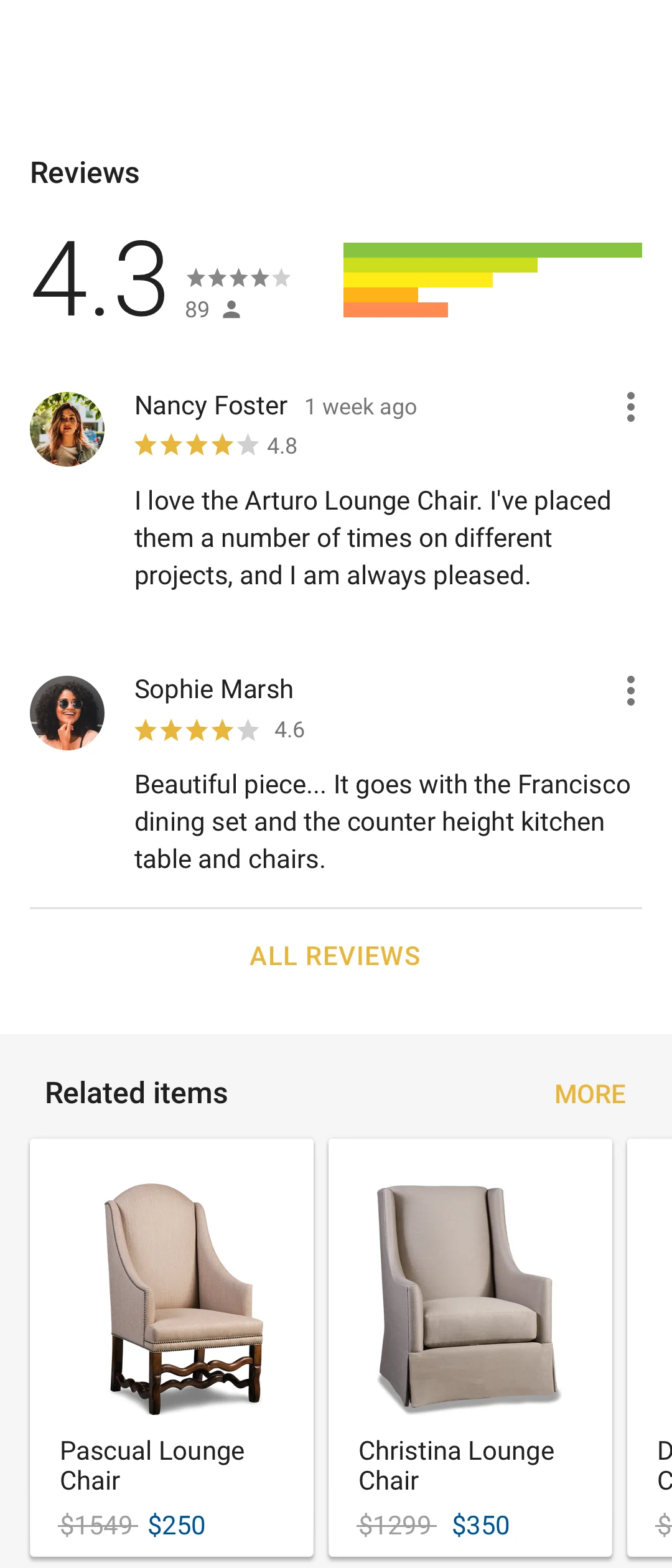
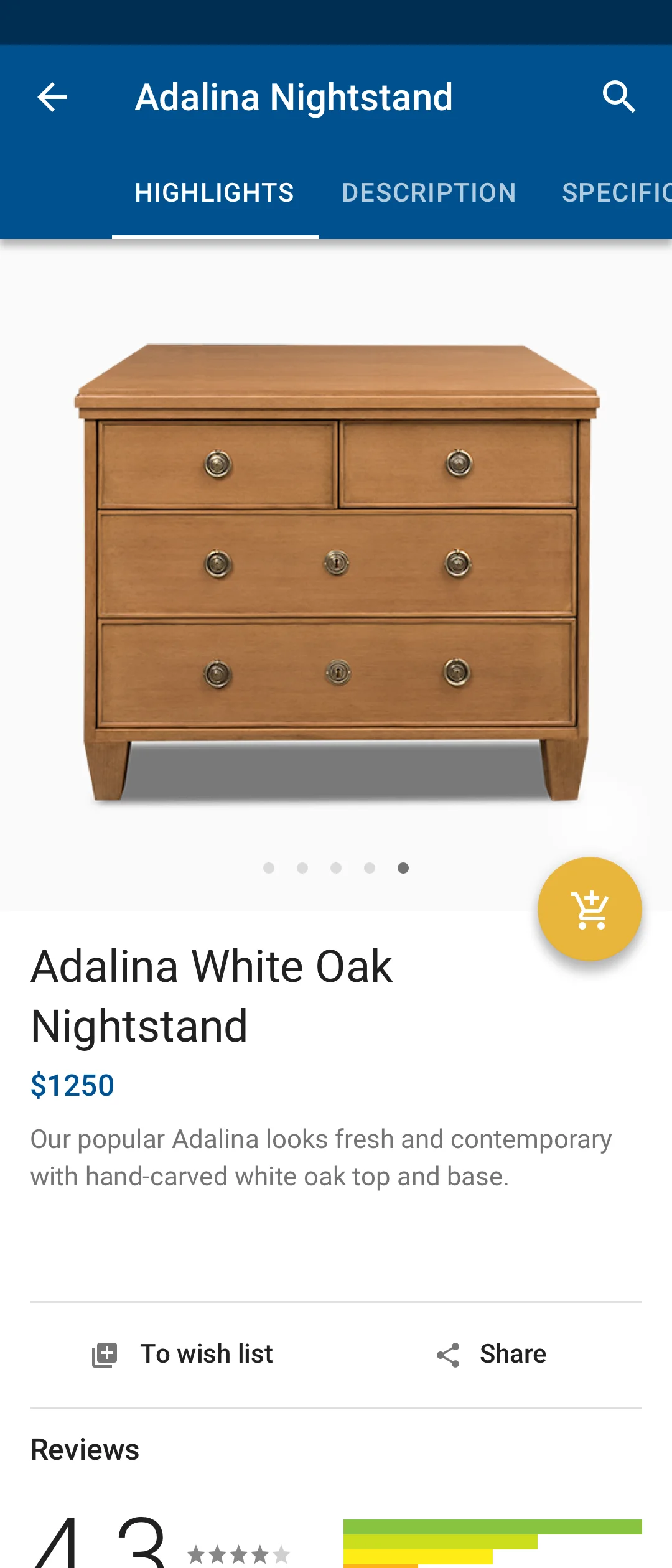
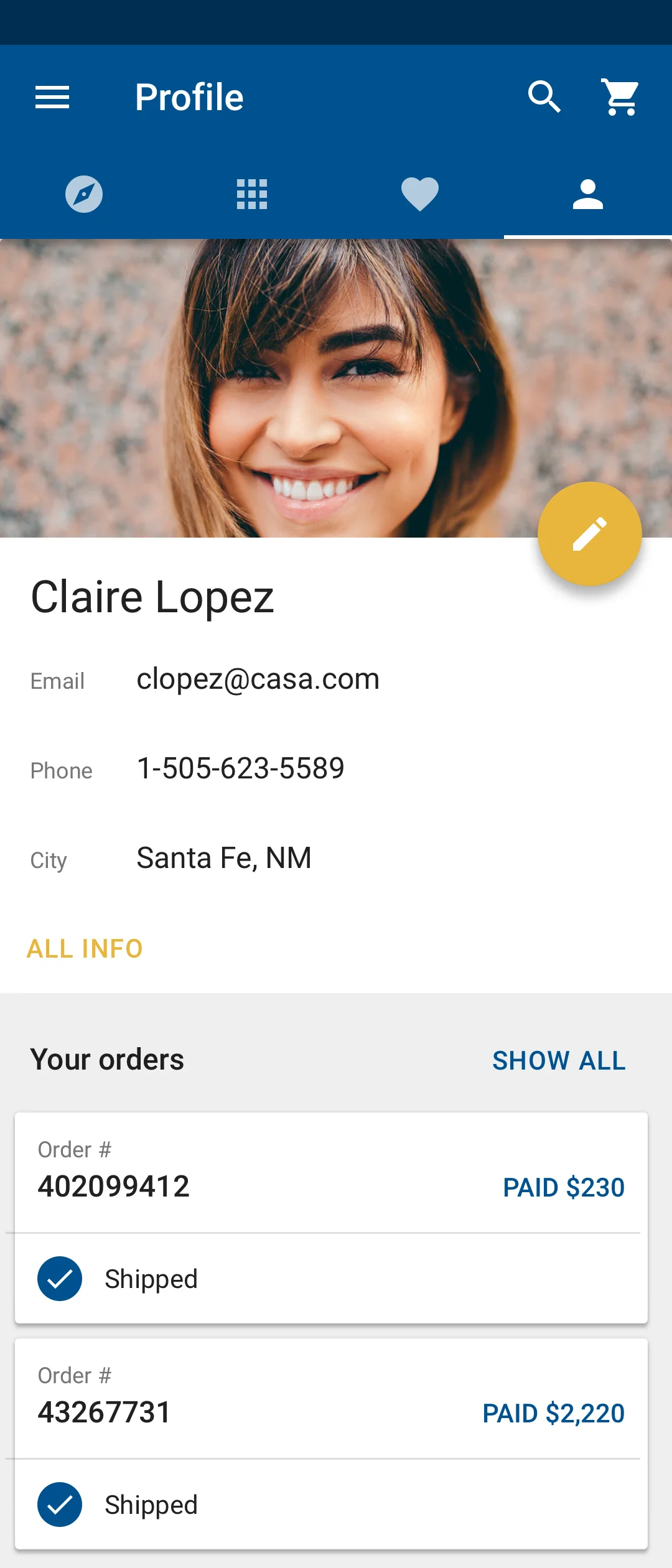
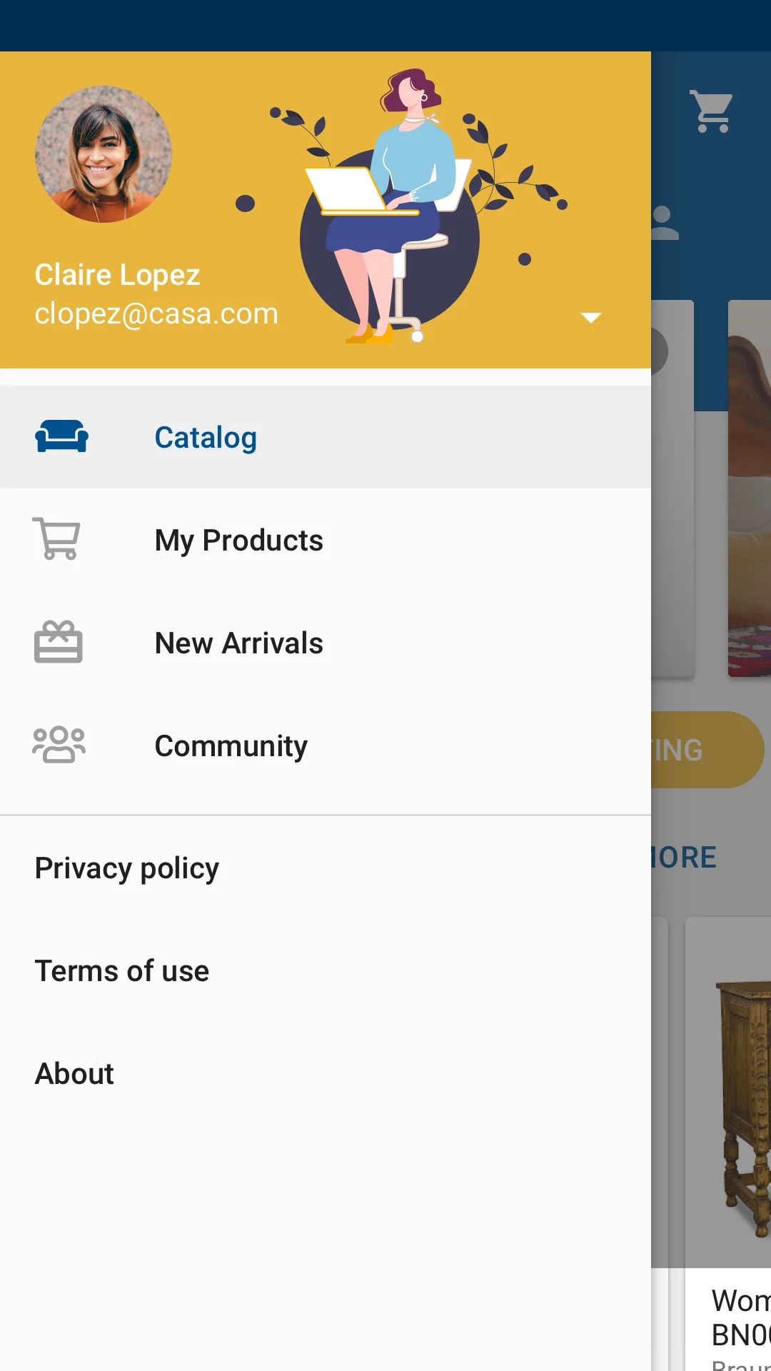
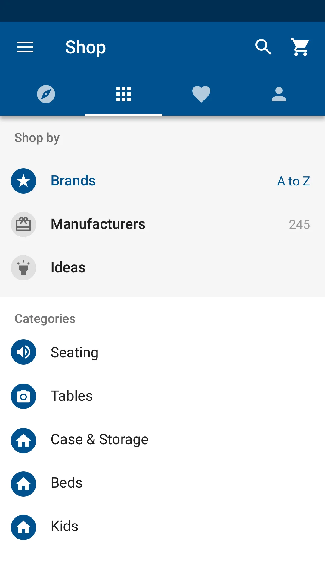
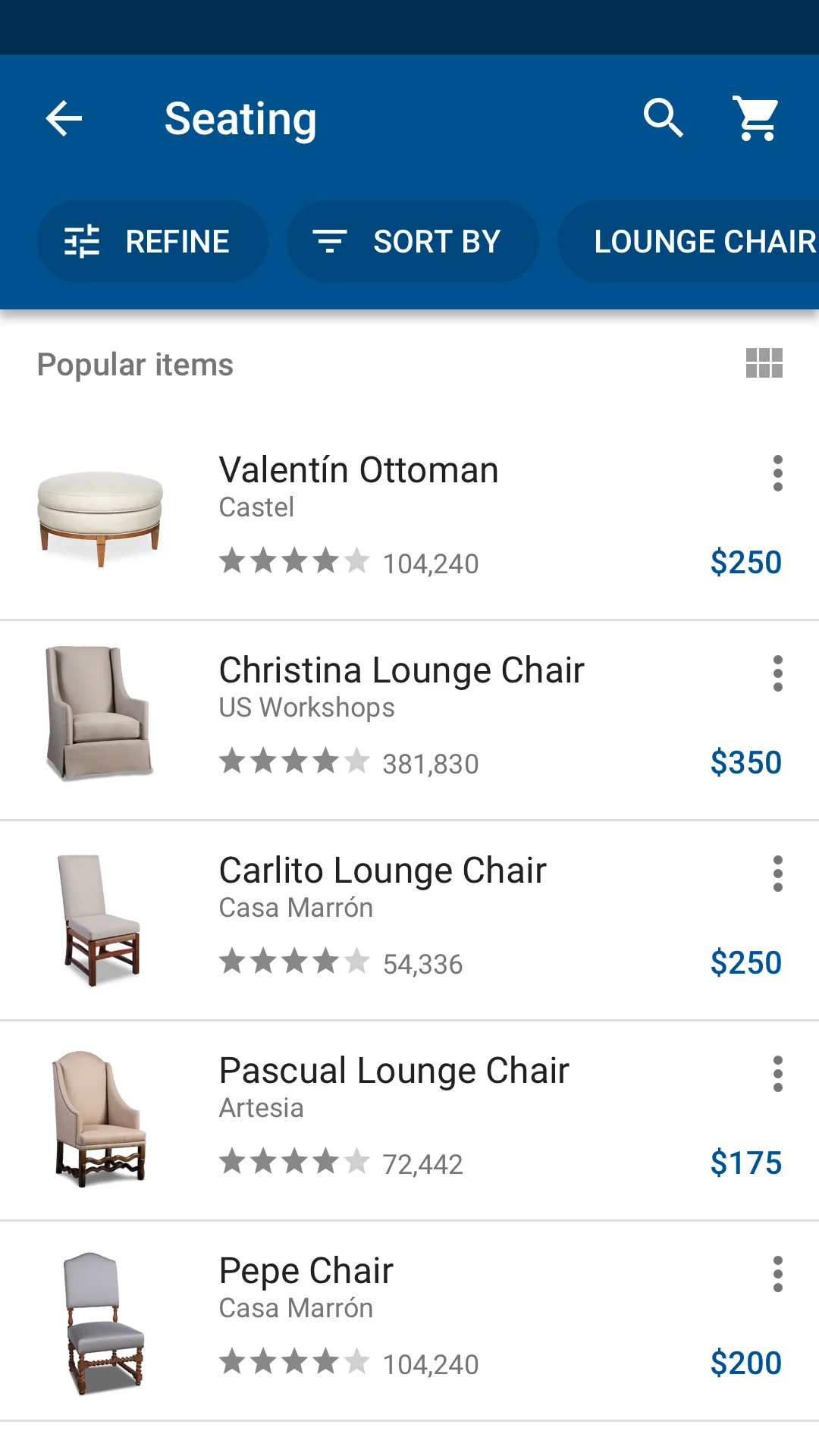
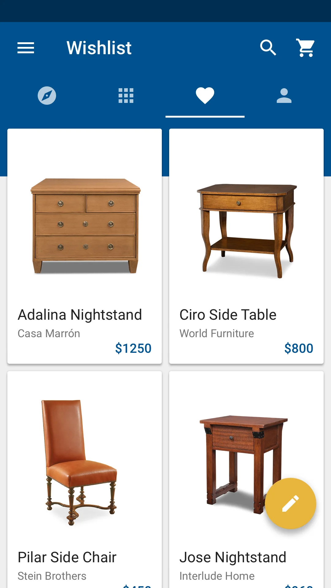
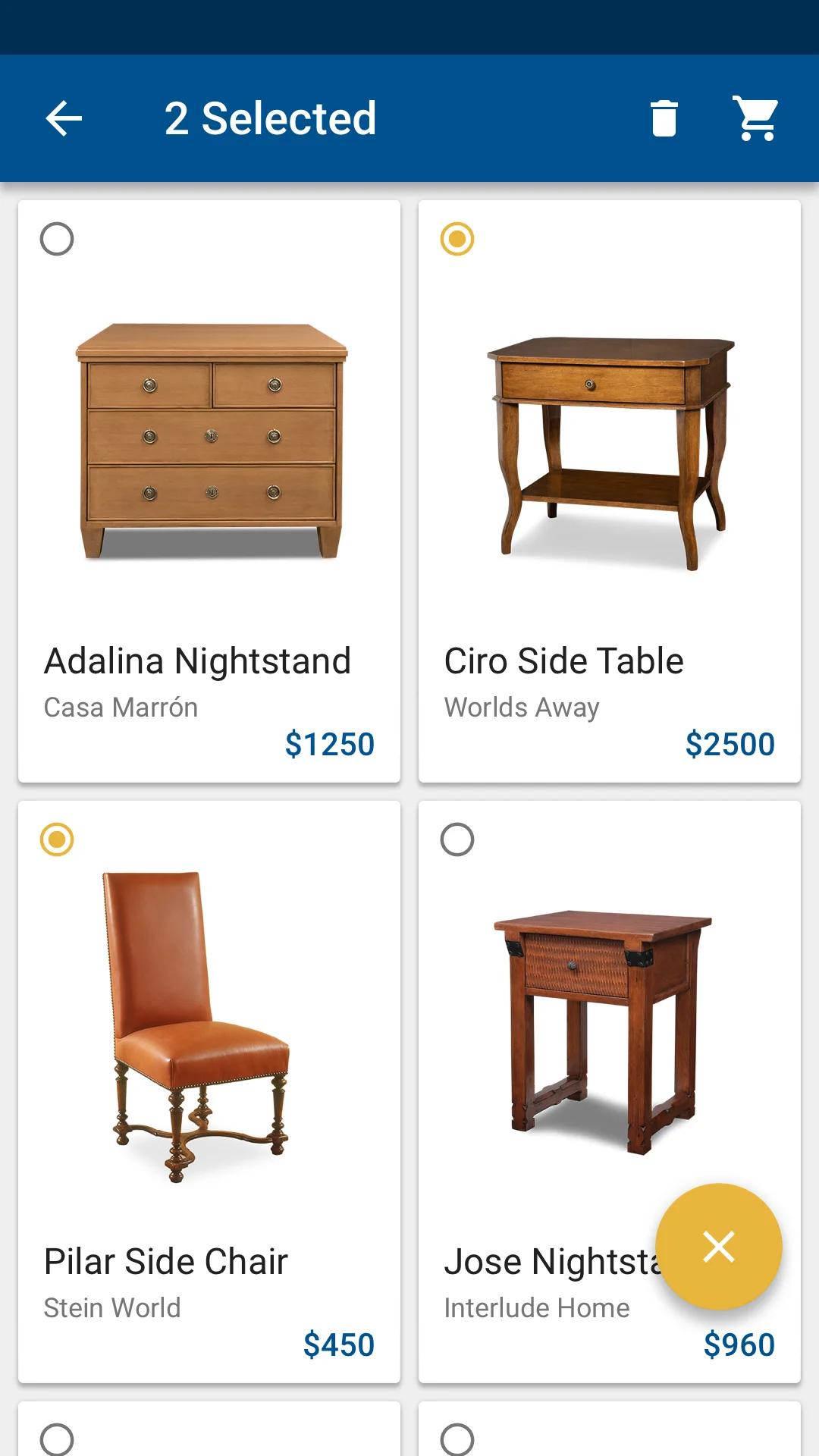
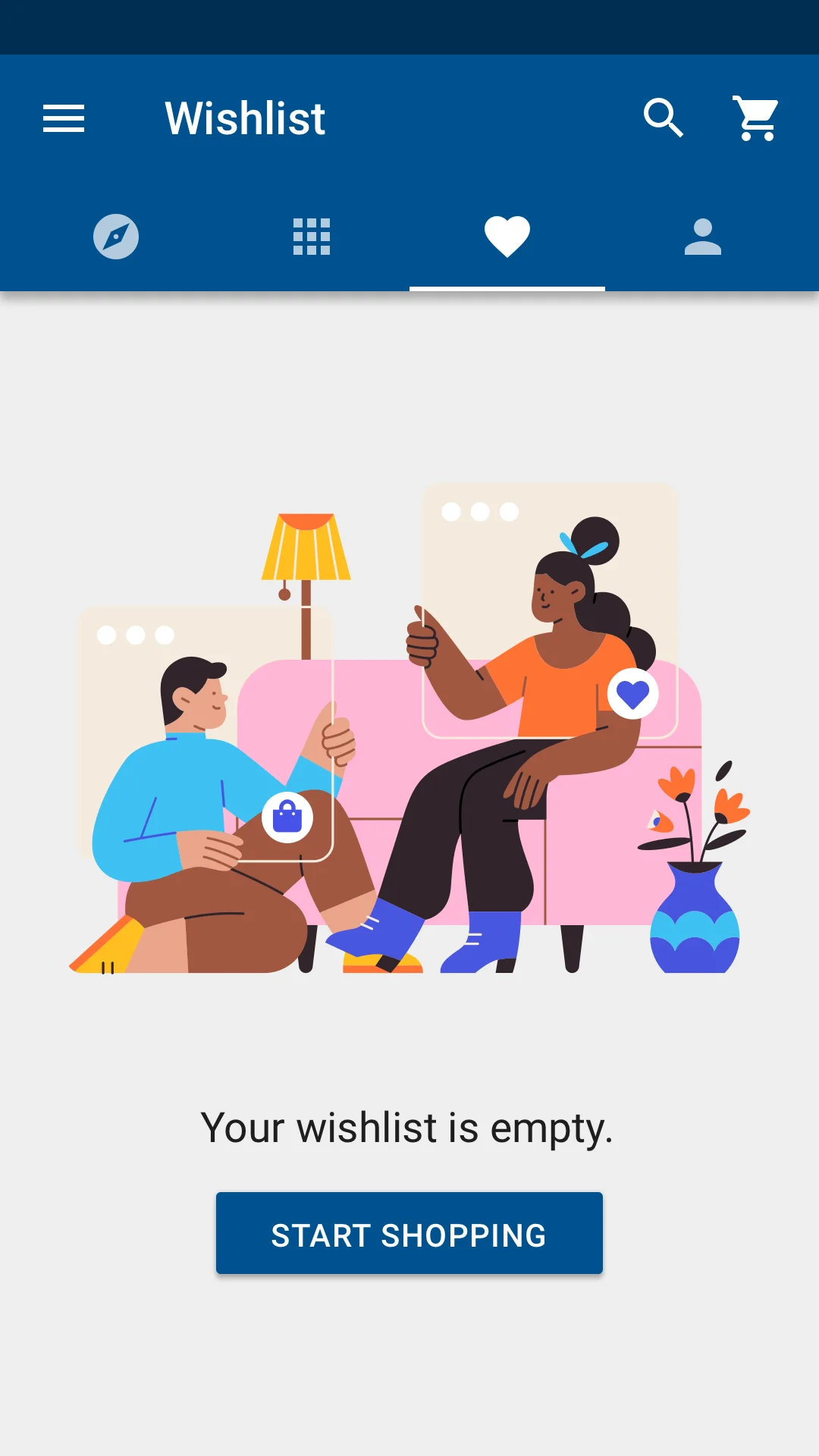
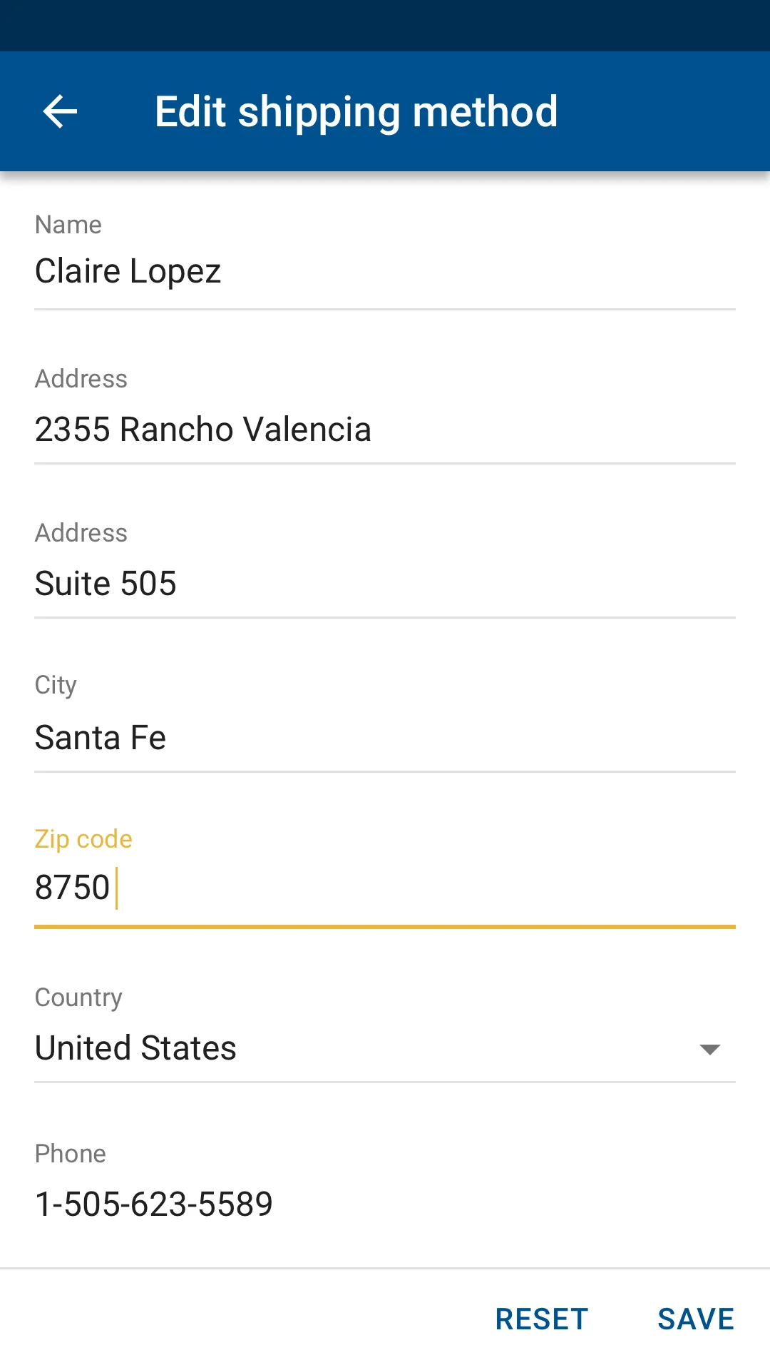
iOS — 28 screens, the full click-through.
Android — 22 screens, search to checkout.
Final comps
Twenty-one polished device renders
The finished composites as delivered — ten iOS, eleven Android — one carousel per platform.
iOS
iOS comp 01
Android
Android comp 01
Design system
One system holding it all together
Behind the four surfaces sits a single design system — color, type, and a full component library — so every screen stays consistent as the product grows. Fifteen pages of it:
The design system — cover
The innovation
ShopTalk — a social layer for the trade
A social network where the personas share information: manufacturers post catalog updates, designers post product reviews — both firsts for B2B furniture, and peer reviews designers could finally trust. Guardrails keep trade pricing and catalogs away from client eyes.
Catalog updates. Manufacturers reach every following designer the moment a line changes.
Product reviews. New to B2B furniture — peer reviews from working designers.
Trade guardrails. Designers control exactly what clients see; trade pricing stays private.
The concept film — paper catalogs set aside for the living one.
Evaluative research
Users, in their own voice
Think-aloud usability sessions ran against the prototypes throughout — product discovery, proposals, quotes, and ShopTalk — each reaction scored on the five-point scale. Five highlights, with the recordings:
- 4/5
“One-stop shopping.” — The unified platform
- 5/5
“Very, very nice.” — The proposal flow
- 5/5
“Fabulous.” — The project status page
- 3/5
“Helpful.” — Product reviews
- 5/5
“Very, very valuable.” — Manufacturer updates
Try it yourself
Open the working prototype
The screens above ship as real, tappable code — browse the catalog, search and filter products, open a maker, build a cart, and move through checkout, screen by screen.
Results
The work became the sales centerpiece
Median usability doubled. Post-design usability rose from 2 to 4 on the five-point scale — meeting and exceeding the project’s UX goals.
Design drove the business. Executive staff called the new designs the center of the company’s marketing and sales.
Renewed beyond scope. The engagement was extended multiple times — on time and on budget, inside the client’s two-week sprints.
New product lines. The native iOS and Android apps opened opportunities the web platform alone couldn’t reach.
The takeaway
Research-led, system-built
TradeSource shows what a user-centered process and a disciplined design system do to a complex B2B problem: three constituencies unified into one ecosystem, usability measurably doubled, and design pulled to the center of how the company sold itself. TradeSource is my internal name for the project.